
Pie charts - Please correct it for me, thank you.
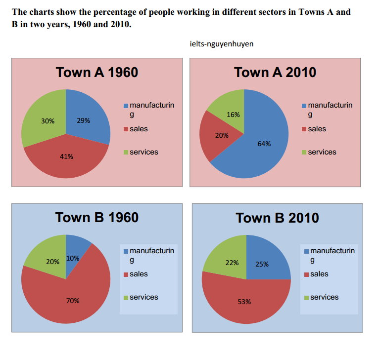
The pie charts compare the number of people working in specific sectors namely manufacturing, sales and services between Town A and B over the course of 50 years, starting 1960.
Overall, while the decreasing number of employees took part in sales in both areas, this category significantly increased in manufacturing. Besides that, services-related-jobs was the least popular with dwellers.
In 1960, an impressive 70% of people in Town B worked in the field of business, as opposed to exactly 41% in Town A. However, the figure declined to 53% for the former and slightly more than a half to 20% for the latter after 50 years. In contrast, the percentage of laborers in production in Town A and B occupied 29% and 10% respectively in 1960. At the end of this period, the figure rose more than double to 64% in Town A compared to only 25% in Town B.
30% was the proportion of people working in services in Town A in 1960, 10% higher than the figure in Town B, at 20%. But in 2010, this sector marked a smaller gap between two cities, at 16% in Town A and at 22% in Town B.
Top answer
Please read my advice for Task 1 essays. IELTS TASK 1: Hints, Tips And Advice Vocabulary Words For Task 1: Reference Post The pie charts compare the number (Wrong word. The charts do not compare the counts of people per sector.
- Please read my advice for Task 1 essays.
- IELTS TASK 1: Hints, Tips And Advice Vocabulary Words For Task 1: Reference Post The pie charts compare the number (Wrong word.
- The charts do not compare the counts of people per sector.
- They do not show that information.
- Some pie charts have both percent and numbers.
Get the Weekly English Kit 📬
New words, one handy idiom, and a 2-minute quiz — delivered to your inbox to keep your streak alive.
 Related Questions