
Pie Chart 1. Plz, someone help me correct this description. Many thanks.
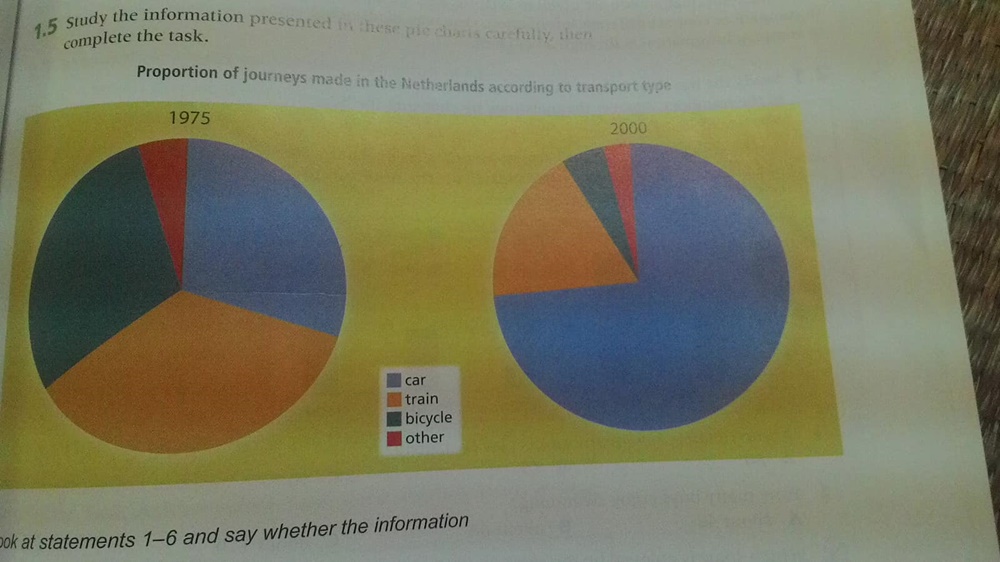
These pie charts shows proportion of journey made in the Netherland according to transport type: car, train, bicyle and other public transport in 1975 and 2000.
Overall, car traffic is the only transport type which its proportion of journey increased.
In 1795, train traffic was the most common transport type in the Netherland which contributed the largest proportion of journey around 35 percent. Car and bicycle also were the main transport types in this country with 25 percent and 23 percent respectively. While other just made 5 percent of journey.
In 2000,we see the increase in proportion of journey car made with almost 75 percent. This put car traffic on the top of these transport type. Train became the second popular type with 15 percent while this bicycle's proportion was 6 percent and other's was 4 percent.
Top answer
Help me with this please. Is this one okay? or what corrections can I make here?
- Help me with this please.
- Is this one okay?
- or what corrections can I make here?
- The pie charts illustrate the proportion of journeys in the year 1975 and 2000 made by all modes of transport in the Netherlands.
- Overall, comparison has been made between the year 1975 and year 2000 to show the change in transportation over the years.
Get the Weekly English Kit 📬
New words, one handy idiom, and a 2-minute quiz — delivered to your inbox to keep your streak alive.
Help me with this please. Is this one okay? or what corrections can I make here?
The pie charts illustrate the proportion of journeys in the year 1975 and 2000 made by all modes of transport in the Netherlands.
Overall, comparison has been made between the year 1975 and year 2000 to show the change in transportation over the years.
As the graphs depict, the former graph demo
 Related Questions