
My writing task 1
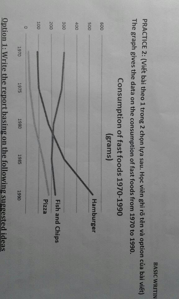
The line graph indicates the using of ready meal in the period of 20 years from 1970 to 1900. It divides into three groups such as Hamburger, Pizza, Fish and Chips.
In general, Consumption of Hamburger and Pizza attracted more customer over period expect the Fish and Chips. Furthermore, the Pizza was still the lowest ready-made food level for 20 years.
Initially, in 1970, 300 thousand paid their money to enjoy Fish and Chips, tripling the number of consumers to eat Hamburger and was near fourfold than Pizza.
From that time onwards, Hamburger and Pizza climbed up. Especially, The former raise gradually for the first 10 years and significantly for the last 5 years to finally peak at 500 thousand people in 1990. Similarly, The latter magnetized a small amount customer for 15 years but Pizza still remained steady at last trend in1990.
In contrast, Although Fish and Chips was the most favorite
fast food in the first period, the sale of ready-away food fall dramatically by almost 100 thousand and became top 2 favorites junk food.
Top answer
You did not understand this graph at all. The graph does not show people or money. ) consumed per person per week in the UK between 1970 and 1990.
- You did not understand this graph at all.
- The graph does not show people or money.
- ) consumed per person per week in the UK between 1970 and 1990.
- The units are in grams.
- In 1970, people in the UK ate, on average, a little over 400 grams of fast food per week.
Get the Weekly English Kit 📬
New words, one handy idiom, and a 2-minute quiz — delivered to your inbox to keep your streak alive.
You did not understand this graph at all. The graph does not show people or money.
Here are some suggestions to get you started:
The line graph plots the amounts of three kinds of fast food (Hamburger, Pizza, and Fish and Chips.) consumed per person per week in the UK between 1970 and 1990. The units are in grams.
In 1970, people in the UK ate, on average, a litt
 Related Questions