
My writing task 1 - 11 . Please evaluate my task and which band i can get in Ielts?
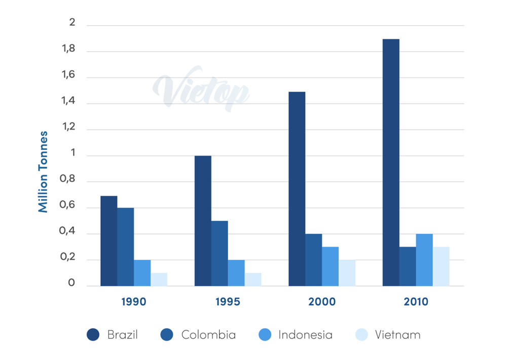
The graph gives information about coffee production in 4 different countries from 1990 to 2010.
The bar chart compares the production of coffee(in millions of tonnes) in four nations ( Brazil, Colombia, Indonesia and Vietnam) over a period of 20 years. Overall, the coffee produced in Brazil had the highest in all four years. There was a growth in the number of coffee produced in three countries apart from Colombia over the period shown.
Between 1990 and 2010, coffee production in Brazil rose more than two times, from 0,7 to 1,9 million tonnes. Similarly, the amounts of coffee produced in Indonesia and Vietnam saw a slight increase by 0,2 million tonnes each. The greatest amount of production of coffee was seen in Brazil in 2010, more than four times as many as the second category, Indonesia and more than six times that of the smallest category , Vietnam and Colombia each.
The trend for coffee production in Colombia was different from the rest of three nations. There was a slight decline, from 0,6 in 1990 to only 0.3 million tonnes in 2010.
Top answer
The bar chart compares the production of coffe e( in millions of tonnes) in four nations ( B razil, Colombia, Indonesia and Vietnam) over a period of 20 years , beginning in 1990 and plotted at five-year intervals. ) Overall, the coffee produced in Brazil had was the highest in all four time points. years .
- The bar chart compares the production of coffe e( in millions of tonnes) in four nations ( B razil, Colombia, Indonesia and Vietnam) over a period of 20 years , beginning in 1990 and plotted at five-year intervals.
- ) Overall, the coffee produced in Brazil had was the highest in all four time points.
- years .
- There was a growth in the number (Coffee is non-count.
- Number of coffee is incorrect.
Get the Weekly English Kit 📬
New words, one handy idiom, and a 2-minute quiz — delivered to your inbox to keep your streak alive.
The bar chart compares the production of coffee(in millions of tonnes) in four nations ( Brazil, Colombia, Indonesia and Vietnam) over a period of 20 years, beginning in 1990 and plotted at five-year intervals.(You need to start a new paragraph here becaus
 Related Questions