
My writing task 1 - 07
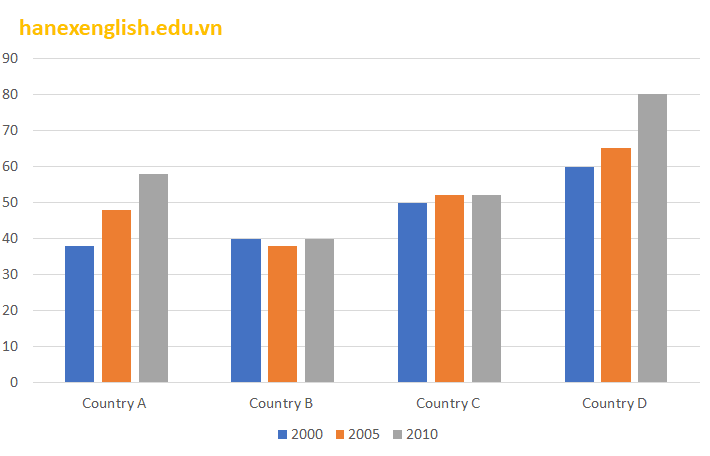
The bar chart shows the percentage of young people in higher education in 2000, 2005 and 2010.
The bar chart compares the proportion of young people in higher education in three different years (2000, 2005, and 2010) in four nations.
Overall, the percentage of young people enrolling higher school was increase in these countries, with the exception of country B in all three years. In addition, the country D had the greatest increase in young people studying higher school during the period shown.
In 2000, the young people in higher education in country D accounted for the highest percentage, which increased almost three seconds of these people in country A, about 60% and 38% respectively. Over the following for ten years, these figures for both countries climbed constantly by 20% each.
Turning to the two remaining countries, we can see that, in country C, young people participation in higher education grew a negligible amount by 2% over a decade. By contrast, these people in country B remained at 40% during the period shown, despite a small drop at 5% in 2005.
Can you get score my writing on which band ??
Top answer
") in three different years (2000, 2005, and 2010) in four nations , referred to as countries A, B, C and D. Overall, the percentage of young people enrolling higher school (awkward, unnatural phrase) was increase (wrong verb form. ") in these countries, with the exception of country B in all three years.
- ") in three different years (2000, 2005, and 2010) in four nations , referred to as countries A, B, C and D.
- Overall, the percentage of young people enrolling higher school (awkward, unnatural phrase) was increase (wrong verb form.
- ") in these countries, with the exception of country B in all three years.
- In addition, the country D had the greatest increase in young people studying higher school (We study English or history.
- ) during the period shown .
Get the Weekly English Kit 📬
New words, one handy idiom, and a 2-minute quiz — delivered to your inbox to keep your streak alive.
The bar chart compares the proportion of young people in higher education (If you want a synonym for "higher education" in British English it is "tertiary educational institutions", and in American English, "post-secondary education." Using text different from the instructions, but with the same meaning, gets you a higher score in "lexical resource.") in three different years (2000, 200
 Related Questions