
My Task 1: Line Graph THANK YOU FOR YOUR HELP
The charts below show the consumption of Coca-Cola’s bottle in different continents and the fluctuated share price per units of it. Overall, the total of bottles was sold is 17.1 bn and North America took the biggest part in consuming the coke even though Africa and the Middle East is the smallest part. Meanwhile, the Coca-Cola share price fluctuated from 1996 to 2001.
As it presented in the pie chart, Africa and the Middle East was the lowest part of the graph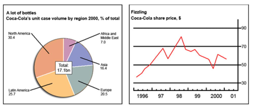
with only 7% people using Coke. After that, Asia is the next with 16.4%, Europe with 20.5%, Latin America with 25.7% and the biggest was North America with 30,4, respectively.
It is evidenced that, the share price of Coke was significantly peaked at 69$ from early 1996 to 1997 and dropped slightly to nearly 60 in the middle of 1997. After that, It was growth to the highest point in the chart about nearly 90$ in 1998 and started to drop steadily from early 99 and rose up again from the first three months in 2000.
Top answer
I am guessing that the topic is this: The chart and graph below give information about sales and share prices for Coca-Cola. You did not describe the pie chart correctly. The charts below show the consumption of Coca-Cola’s bottle (unnatural.
- I am guessing that the topic is this: The chart and graph below give information about sales and share prices for Coca-Cola.
- You did not describe the pie chart correctly.
- The charts below show the consumption of Coca-Cola’s bottle (unnatural.
- You are writing that people eat one bottle.
- " That is not what the chart shows.
Get the Weekly English Kit 📬
New words, one handy idiom, and a 2-minute quiz — delivered to your inbox to keep your streak alive.
I am guessing that the topic is this: The chart and graph below give information about sales and share prices for Coca-Cola.
You did not describe the pie chart correctly.
The charts below show the consumption of Coca-Cola’s bottle (unnatural. You are writing that people eat one bottle. And that bottle belongs to a person or company named "Coca-Cola." That is not wha
 Related Questions