
Line Graph - Task 1 IETLS
The line graph illustrates the birth rate and death rate of a country, namely New Zealand from 1901 to 2101.
Overall, the birth rate of New Zealand had been higher than the death rate over the period shown. In the future, however, there is expected to be an opposing trend that deaths are going to be larger than births.
In 1901, New Zealand had about 20,000 births. This figure considerably increased to 40,000s after 40 years and reached its peak of roughly 65,000s in 1961. Concurrently, the death rate of New Zealand also rose gradually and continued to rise to about 35,000 deaths in this year, 2021. Whereas, there has been a slight decrease to 50,000 births in New Zealand at the same time.
By 2061, the death rate is anticipated to constantly increase and reach its high of roughly 58,000s this figure is going to stabilize at about 57,000s until 2101. In contrast, from 2021 to 2191, the birth rate is expected to see a steady decrease to 42,000s births.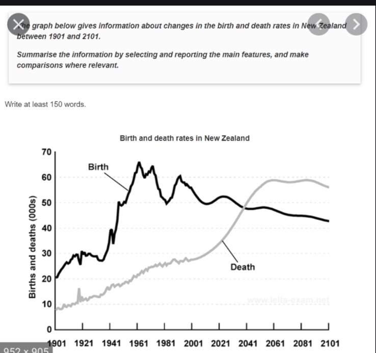
Top answer
The line graph illustrate s (not a good word choice. There are many better ones. ) plots / shows / gives / compares the birth rate and death rate of a country, namely New Zealand from 1901 to 2101 .
- The line graph illustrate s (not a good word choice.
- There are many better ones.
- ) plots / shows / gives / compares the birth rate and death rate of a country, namely New Zealand from 1901 to 2101 .
- ) Overall, the birth rate of New Zealand had been higher than the death rate over the period shown .
- (That is not a good expression.
Get the Weekly English Kit 📬
New words, one handy idiom, and a 2-minute quiz — delivered to your inbox to keep your streak alive.
The line graph illustrates (not a good word choice. There are many better ones. ) plots / shows / gives / compares the birth rate and death rate of a country, namely New Zealand from 1901 to 2101. (This date range inclu
 Related Questions