
Line graph 1
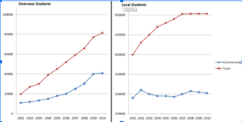
The graphs below show the enrolments of overseas students and local students in Australian universities over a ten-year period.
Summarise the information by selecting and reporting the main features, and make comparisons where relevant.
The line graphs compare the number of overseas students and Australian students attending universities between 2001 and 2010.
It is clear that the enrolment of both overseas students and local students rise over the period shown. Overall, the total number of Australian students enrolling is much higher than the overseas’ number. But the commencing number of indigenous students is lower than the foreign ones.
In 2001, starting overseas students went to Australian universities is at about 12.000, and the total number is 20.000. The figures for local students stood at just around 18.000, but the total number is twice as the sum of the overseas. Overall attendance of overseas students increased gradually over the following years, peaked in 2010 at 80.000, a fourfold increase compared to 2001. The total number of local students also increase, before reaching over 600.000 students in 2007, and remained stable the next three years.
While the number of overseas commencing learners saw a stable increase over the 10 years, stood at 40.000 in 2010, the figures for Australian students enrolling for the first time fluctuated, falling between 2002 and 2006, reaching 21.000 in 2008 and dropping to 20.000 in 2010
Top answer
Please read my advice for Task 1 essays: IELTS TASK 1: Hints, Tips And Advice Vocabulary Words For Task 1: Reference Post
- Please read my advice for Task 1 essays: IELTS TASK 1: Hints, Tips And Advice Vocabulary Words For Task 1: Reference Post
Get the Weekly English Kit 📬
New words, one handy idiom, and a 2-minute quiz — delivered to your inbox to keep your streak alive.
Please read my advice for Task 1 essays:
The (How many?) line graphs compare the number of overseas students with and Australian students attending universities (That is incomplete. There are two curves on each of two graphs. You have not explained it well.) between 2001 and 2010.
It is clear that (Re
 Related Questions