
Leave comments on my beginner task 1
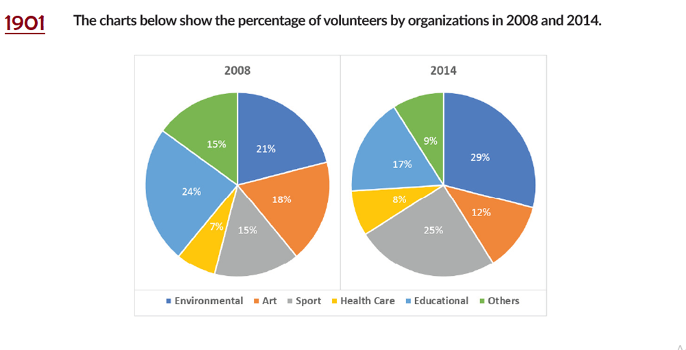
The provided pie chart demonstrates the proportion of voluntary organizations in different fields in the two years 2008 and 2014.
At the first glance, the percentage of volunteers of environmental and sport area increased steadily from 7% to 10% during the 6 years. Oppositely, participants in charitable organizations in the three namely art, education and others fell by approximately 7%.
As shown in the figure, despite experiencing a reduction in 2014, the amount of educational non-profit organization remained constantly higher than art section at 6%. Notably, people equally got involved in non-profit sport foundation and others foundation in 2008 whereas the data in the former was almost three times larger than the latter in 2014.
Generally, people were more likely to join in voluntary environmental establishments than the other ones in both studied year, 21% and 29% respectively. Interestingly, there was a moderate growth in health care section as the rise ratio is 1%.
Top answer
The provided (It is not natural English to write "provided" or "given". How many pie charts? ) pie chart demonstrates (wrong verb) the proportion of voluntary organizations (Incorrect.
- The provided (It is not natural English to write "provided" or "given".
- How many pie charts?
- ) pie chart demonstrates (wrong verb) the proportion of voluntary organizations (Incorrect.
- g.
- ) in different fields in the two years 2008 and 2014.
Get the Weekly English Kit 📬
New words, one handy idiom, and a 2-minute quiz — delivered to your inbox to keep your streak alive.
The provided (It is not natural English to write "provided" or "given". How many pie charts? There is more than one.) pie chart demonstrates (wrong verb) the proportion of voluntary organizations (Incorrect. There are not e.g. 600 organizations and this is the relative num
 Related Questions