
I’m practicing for IELTS writing. I hope to be able to take some good advice and evaluation from people here
The chart shows the unemployment situation in Australia in the year 2012.
Summarise the information by selecting and reporting the main features, and make comparisons where relevant.
You should write at least 150 words.
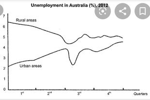
The line graph plots the percentage of citizens without occupation in city and countryside within 4 quarters of 2012 in Australia.
Overall, the ratio of unemployment in rural areas to urban areas was higher. At the beginning of the year, the percentage of people without jobs tended to downward in rural areas and upward in urban areas. It is exceedingly apparent that both areas had the fewest unemployed people at the middle of the year and turned into increasing at the end.
In more detail, we can see the difference in unemployment between both areas in the first two quarters, rising significantly from 2% to 4% in urban and descending dramatically in rural, around 1.5%. However, both lines suddenly dropped deeply and reached the lowest in the third quarter, in the countryside about 4%, in the city approximate 2%. After the downward trend, both data went to the steady upward trend for a while.
Moreover, the percentages of unemployment in both areas in last quarter are closest compared to another quarter and likely approximate.
Get the Weekly English Kit 📬
New words, one handy idiom, and a 2-minute quiz — delivered to your inbox to keep your streak alive.
 Related Questions