
I'm a new member, please help me with my writing task 1
The chart below shows global sales of the top five mobile phone brands between 2009 and 2013.
The bar chart illustrates the number of mobile phones sold worldwide by five best selling establishments in three years 2009, 2011 and 2013.
Overall, Nokia is the leading manufacturer in the mobile phone sale in 2009. However, Samsung saw a remarkable rise in the number of handsets purchased over the 5-year period.
It is envident that Samsung vendor just sold well over 200 million mobile phones in 2009, but this figure had increased to approximately 450 million units in the year of 2013. By constrast, in 2009, eventhough Nokia vendor accounted for the highest number of mobile phone sold, there was an downward trend in that statistic by 200 million units in 2013.
From the chart it can be seen that the purchases of mobile phone by Apple, LG and ZTE companies in 2009 were by far less justifiable than the remaining top two brands’ figure. Whilst the handset sale of Apple vendor increased significantly by around 130 million units between 2009 and 2013, LG manufacturer saw a steady drop in the number of purchases and the figure for ZTE brand changed marginally over the period shown.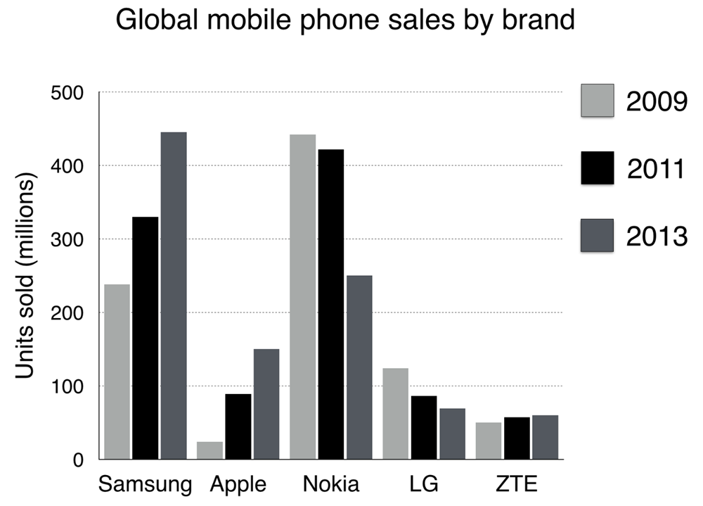
Top answer
The bar chart illustrates (Wrong word. Use 'illustrate" for maps, diagrams, process flow charts, and other pictorial types. ) the number of mobile phones sold worldwide by five best selling establishments (wrong word.
- The bar chart illustrates (Wrong word.
- Use 'illustrate" for maps, diagrams, process flow charts, and other pictorial types.
- ) the number of mobile phones sold worldwide by five best selling establishments (wrong word.
- ) in three years 2009, 2011 and 2013.
- ) Overall, Nokia is the leading manufacturer in the mobile phone sale (wrong phrase.
Get the Weekly English Kit 📬
New words, one handy idiom, and a 2-minute quiz — delivered to your inbox to keep your streak alive.
The bar chart illustrates (Wrong word. Use 'illustrate" for maps, diagrams, process flow charts, and other pictorial types. Not for math plots.) the number of mobile phones sold worldwide by five best selling establishments (wrong word. An establishment is typically a high-end restaurant or
 Related Questions