
ILETS WRITING TASK 1
Please give feedback and help me point out the mistakes and give me a band score too! Thank you so much!
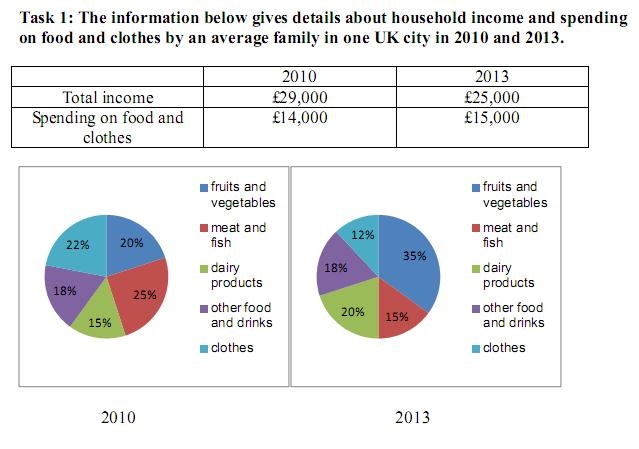
The table shows total family income per household in a UK city in 2010 and 2013, together with specific expenditure on food and clothes. The two pie charts illustrate how spending on food and clothes was divided into five categories.
Overall, it is clear that total income in 2013 decreased, whereas spending on food and clothes rose from the 2010 figure. The proportion spent on fruits and vegetables increased dramatically in 2013.
A significant fell of $4000 was witnessed in total household income from 2010 to 2013. The period observed a slight climb in the expenditure on food and clothes, from $14000 in 2010 to $15000 in 2013.
Turning to the pie chart, the percentage spent on fruits and vegetables grown sharply, to reach 35% in 2013. In terms of dairy products, this figure increased from 15% to 20%. In contrast, the proportion spent on other food and drinks remained the same at 18%, the figure for the remaining categories declined remarkably by 10%.
Top answer
Please read my advice for Task 1 essays. It will explain the reasons I marked some things wrong. IELTS TASK 1: Hints, Tips And Advice Vocabulary Words For Task 1: Reference Post The table shows average total family income and expenditure on food and clothes per household (repetitive.
- Please read my advice for Task 1 essays.
- It will explain the reasons I marked some things wrong.
- IELTS TASK 1: Hints, Tips And Advice Vocabulary Words For Task 1: Reference Post The table shows average total family income and expenditure on food and clothes per household (repetitive.
- Family has the same meaning as household) in a UK city in 2010 and 2013 , together with specific expenditure on food and clothes.
- The two pie charts illustrate (wrong word) break down the how spending on food and into clothes and four food categories: dairy; fruits and vegetables; meat and fish; and other food and drinks.
Get the Weekly English Kit 📬
New words, one handy idiom, and a 2-minute quiz — delivered to your inbox to keep your streak alive.
Please read my advice for Task 1 essays. It will explain the reasons I marked some things wrong.
 Related Questions