
IETLS Writing Task 1
Can you please check my work? Thank you in advance.
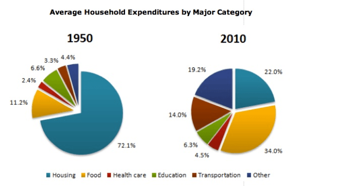
The pie charts illustrate the changes in the household spending on 6 different items in a county in two different years (1950 and 2010 ).
Overall, the majority of households spent their wages on food and housing in both years, while health care accounted for a small amount of household expenditures. In addition, there was a rapid change in the wages spent on housing, food, transportation and other categories, whereas the amount of money spent on health care and education changed slightly.
The amount of wages spent on housing comprised of 72.1% in 1950, which then dropped dramatically almost a quarter (22%). In contrast, the proportion of money spent food increased rapidly from 11.2% in 1950 to 34% in 2010. Similarly, there was a moderate growth in the amount of money spent on transportation and other categories, from 3.3% and 4.4% in 1950 to 14% and 19.2% in 2010.
In addition, wages spent on education and health care saw minor changes. The amount of money spent on health care rose slightly from 2.4% in 1950 to 4.5% in 2010, while the figure for education declined from 6.6% in 1950 to 6.3% in 2010.
Get the Weekly English Kit 📬
New words, one handy idiom, and a 2-minute quiz — delivered to your inbox to keep your streak alive.
 Related Questions