
Ielts_Writingtask1_cam10_test1
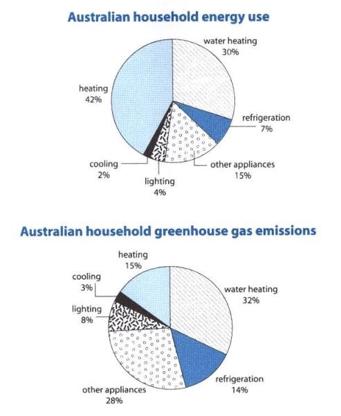
The pie chart compares six sectors in which energy is consumed by typical family in Australia, while the second chart shows the corresponding greenhouse gas emissions in consequence of energy consumption in these sectors by Australian.
In conclusion, energy is utilized the most in heating and water heating, lead to the greenhouse gas emissions constituted immensely by energy usage of both sectors in Australia as well.
In an average Australia household, heating and water heating account for 42% and 30% of total energy consumption respectively. the remainders are included, at 15% of energy usage in other appliances and the lower percentage of energy utilized in refrigeration, at 7%, whereas general proportion of lighting and cooling, solely at 6%, is the lowest percentage of energetic consumptions.
Water heating is responsible for the highest proportion of the amount of the greenhouse gas emission, is the equivalent level as energy usage in Australia. It’s noticeable that only 15% of the greenhouse gas produced in heating although It needs using energy mostly. This effect in refrigeration, lighting and cooling are doubling higher than the energetic consumption with 14%, 28% and 8% respectively, while 3% of the greenhouse gas constituted in cooling is the smallest percentage in Australia
Top answer
) compares six sectors (wrong word. ) in which energy is consumed by a typical family in Australia, while the second chart shows the corresponding greenhouse gas emissions in consequence of energy consumption (wrong expression) in these sectors (wrong word. ) by Australian .
- ) compares six sectors (wrong word.
- ) in which energy is consumed by a typical family in Australia, while the second chart shows the corresponding greenhouse gas emissions in consequence of energy consumption (wrong expression) in these sectors (wrong word.
- ) by Australian .
- ( An Australian is one person.
- ) In conclusion, (wrong phrase.
Get the Weekly English Kit 📬
New words, one handy idiom, and a 2-minute quiz — delivered to your inbox to keep your streak alive.
The pie chart (This means there is only one pie chart.) compares six sectors (wrong word. ) in which energy is consumed by a typical family in Australia, while the second chart shows the corresponding greenhouse gas emissions in consequence of ener
 Related Questions