
IELTS.WRITING TASK 1
I really need someone to check my mistakes and correct them for me. I would appreciate your assistance very much.
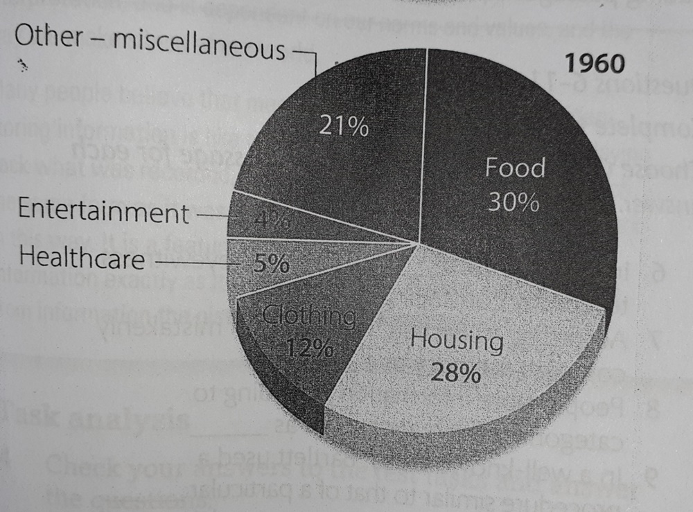
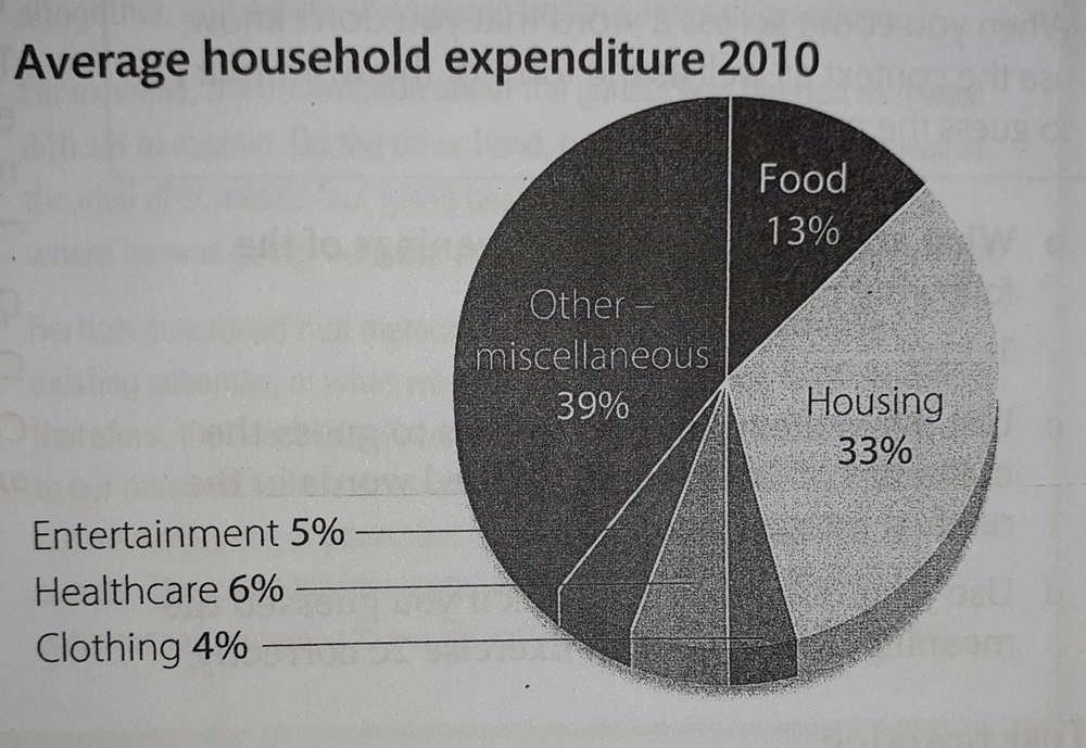
The charts below show the percentage of spending on different areas in the average household in one country in 1960 and 2010.
Summarise the information by selecting and reporting the main features, and make comparisons where relevant.
The two pie charts compare proportionate expenditure of household spending in a country in a period of fifty years. The datas are for the year 1960 and 2010, and the six items of spending are food, housing, clothing, healthcare, entertainment and others.
Overall, people's maximum spending went on food, housing and others while the least amounts were spent on clothing, healthcare and entertainment.
First, the most notable change was in the proportion of the budget spent on food. This went down from 30% in 1960 to 13% in 2010. Other items was climbed in important, by 18%. By contrast, there was a slight increase, of 5%, in spending on housing. After housing, the next two less rising areas were entertainment and healthcare Meanwhile, as part of the house hold budget, clothing fell dramatically from 12% in 20th century to 4% in 21st century.
/data/user/0/com.samsung.android.app.notes/files/clipdata/clipdata_191124_005404_022.sdoc->
Get the Weekly English Kit 📬
New words, one handy idiom, and a 2-minute quiz — delivered to your inbox to keep your streak alive.
 Related Questions