
IELTS writting task 1
The following bar chart shows the different modes of transport used to travel to and from work in one European city in 1960, 1980 and 2000.
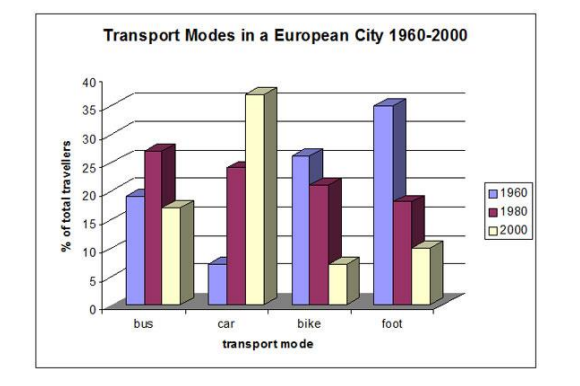
The bar chart illustrates the percentage of four ways that people in a European city used to go to work in three different years.
Overall, there was plenty of significant variations in 1960, 1980 and 2002. The travellers who went by bike and by foot decreased continually while the percentage of people chose the car to go to work increase rapidly.
The percentage of people using the bus in 1960 was nearly 20% and then increased to 23% in 1980. In a similar way, the traveller using car grew from 5% to about 23%. By contrast, there was a slight reduction in the number of passengers using the bike and the people walking. In detail, the percentage went down from 25% to 20% in terms of people using the bike and from nearly 30% to above 20% with people went by foot.
In 2002, there was a small difference in comparison with the year 1980 that the people went to work by bus decline to 17%. The rest of transport modes didn’t appear any fluctuation when the passengers using car reach a peak at above 40% while the percentage with people using the bike and walking decreased to nearly 5% and 10% sequentially.
Top answer
I've forgotten that I have to use "on foot ' instead "by foot". What a massive mistake!
- I've forgotten that I have to use "on foot ' instead "by foot".
- What a massive mistake!
Get the Weekly English Kit 📬
New words, one handy idiom, and a 2-minute quiz — delivered to your inbox to keep your streak alive.
I've forgotten that I have to use "on foot ' instead "by foot". What a massive mistake!
The bar chart illustrates the percentage of four ways (Incorrect description) that people in a European city used to go to work in three different years (which years?).
Overall, there was (wrong form)
 Related Questions