
IELTS writng task 1
The table below gives information on the proportion of carbohydrates, protein and fat in three different diets.
Write a report for a university lecturer describing the information shown below. Make comparisons where relevant.
The proportion of carbohydrates, protein and fat in three different diets
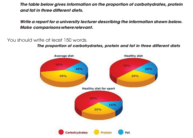
The pie charts show the percentage of carbonhydrates, protein and fat in three categories of diets, namely an average diet, healthy diet and healthy diet for sport.
It is clear that carbonhydrates have the largest proportion in each diet especially in healthy diet for sport. Although an average diet has the lowest proportion, it requires higher percentage of protein than healthy diet and healthy diet for sport.
We can see that, carbonhydrates in healthy diet for sport are large, 60%, compared with healthy diet, 50%, and average diet, just 40%. While people who eat an average diet require a greater amount of protein, 40%, than those who eat a healthy diet, 30%, and healthy diet for sport, 25%.
It can be seen that the figure for the proportion of fat just make up one fifth of both average diet and healthy diet, but it drops to 15% for healthy diet for sport.
Top answer
The pie charts show the percentage of carbonhydrates , protein and fat in three categories of diets, namely an average diet, a healthy diet and a healthy diet for sport. It is clear that carbonhydrates have the largest proportion in each diet, especially in the healthy diet for sport. Although an average diet has the lowest proportion, it requires a higher percentage of protein than the healthy diet and the healthy diet for sport.
- The pie charts show the percentage of carbonhydrates , protein and fat in three categories of diets, namely an average diet, a healthy diet and a healthy diet for sport.
- It is clear that carbonhydrates have the largest proportion in each diet, especially in the healthy diet for sport.
- Although an average diet has the lowest proportion, it requires a higher percentage of protein than the healthy diet and the healthy diet for sport.
- We can see tha t, (no comma) carbonhydrates in healthy diet for sport are large, 60%, compared with the healthy diet, 50%, and average diet, just 40%.
- While people who eat an average diet require consume a greater amount of protein, 40%, than those who eat a healthy diet, 30%, and or a healthy diet for sport, 25%.
Get the Weekly English Kit 📬
New words, one handy idiom, and a 2-minute quiz — delivered to your inbox to keep your streak alive.
The pie charts show the percentage of carbonhydrates, protein and fat in three categories of diets, namely an average diet, a healthy diet and a healthy diet for sport.
It is clear that carbonhydrates have the largest propor
 Related Questions