
IELTS Writing Task I (Line Graph)
Hi. I am practicing in writing so I extremely appreciate your time and consideration in checking my essay.
Topic: The graph below shows average carbon dioxide (CO2) emissions per person in the United Kingdom, Sweden, Italy and Portugal between 1967 and 2007.
Summarize the information by selecting and reporting the main features, and make comparisons where relevant.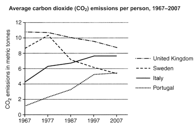
And here is my essay:
The line graph indicates how much carbon dioxide emitted per person in four countries from 1967 to 2007.
Overall, there were downward trends in the consumption of CO2 in the UK and Sweden whereas the two remain nations experienced steady increase in the same category.
In 1967, the United Kingdom was the largest emitter of CO2 as the carbon footprint of each citizen reached nearly 12 metric tones. Although this country was still the highest contributor till 2007, its consumption decreased significantly to about 9 metric tones. While having been the second nation producing most CO2 at 10 metric tonnes in the first year, Sweden soon lost its place as the amount of CO2 consumed reduced to 6 metric tonnes, which meant that it was the same place along with Portugal.
On the other hand, Italy and Portugal both experienced upward trend in the amount of carbon dioxide emitted. Starting at 4 metric tonnes, Italy’s consumption of CO2 soon rose to nearly 8 metric tonnes in 1997 and levelled of from that. As well, despite having the lowest consumption of emission in 1967, the last country soon saw a slow increase in the emission and then shared the same place with Sweden at 6 metric tonnes.
Thank you for checking my essay.
Get the Weekly English Kit 📬
New words, one handy idiom, and a 2-minute quiz — delivered to your inbox to keep your streak alive.
 Related Questions