
IELTS Writing Task I
Hi. Currently, I'm practicing writing IELTS Task I so I really appreciate your time checking my essay. Thanks a lot.
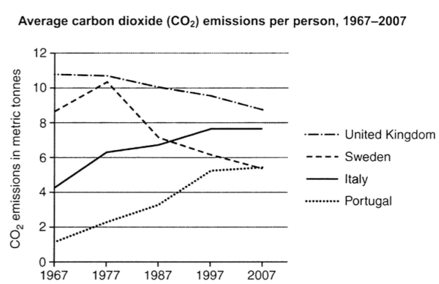
Topic: The graph below shows average carbon dioxide (CO2) emissions per person in the United Kingdom, Sweden, Italy and Portugal between 1967 and 2007.
Summarize the information by selecting and reporting the main features, and make comparisons where relevant.
Here is my essay:
The line graph indicates how much carbon dioxide emitted per person in four countries from 1967 to 2007.
Overall, there were downward trends in the consumption of CO2 in the UK and Sweden whereas the two remain nations experienced steady increase.
In 1967, the United Kingdom was the largest emitter of CO2 as the carbon footprint of each citizen reached nearly 12 tones. However, since 1977, the consumption of carbon dioxide in UK decreased steady to end at just under 9 tones. The second emitter of this greenhouse gas was regarded as Sweden, with the statistic began just below 8 tones. Apart from a brief rise from 1967 to 1977, this country witnessed the significant decline over the 30-year time scale to finish at nearly 6 tons, which meant that it shared the rank with Portugal.
In sharp contrast to this, the other countries saw the rise in the amount of CO2 consumed. CO2consumption in Italy increased gradually until it overtook the consumption of Sweden in 1997 at 8 tones. It then leveled off in the last 10 years. Portugal also witnessed a growth in the amount of greenhouse gas from 1 ton to 5 tones between 1967 and 2007, making it the same level as Sweden.
Once again, thanks for your help.
Get the Weekly English Kit 📬
New words, one handy idiom, and a 2-minute quiz — delivered to your inbox to keep your streak alive.
 Related Questions