
IELTS writing task 1: Water usage in San Diego, California and the rest of the world.
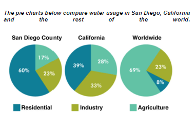
The graphs provide a water usage comparison between San Diego, California and the world. Overall, we can clearly see that the amount of water consumed by residents in SanDiego correlated negatively with the worldwide’s number. On the other hand, California shows an evenly distributed proportion among the three sectors.
Figuratively, domestic water usage in San Diego is the highest among the three, with exactly 60% of the water being used for that sole purpose. In contrast, the sector that requires the least amount of water in the world is residential, with only 8%, whereas agriculture takes up most of the pie chart with 69%. It is also noticeable that San Diego has the exact percentage of water used for industry as the world, which is 23%.
Contradicting with the drastic differences in proportions of water usage in San Diego and the world, California has a more evenly distributed graph with 28% and 33% of water being used for agriculture and industry respectively. Residential water usage in California also take the largest part of the pie chart like San Diego but at a much lower number, 39%. (185)
Top answer
) provide a water usage comparison between California, San Diego County , California and the world. (You did not finish describing the graphic. ) Overall, we can clearly see that the amount of water consumed by residents in SanDiego correlated (Correlation makes no sense with pie charts.
- ) provide a water usage comparison between California, San Diego County , California and the world.
- (You did not finish describing the graphic.
- ) Overall, we can clearly see that the amount of water consumed by residents in SanDiego correlated (Correlation makes no sense with pie charts.
- Correlation is used to measure the degree that two different variables move in the same (or opposite) directions.
- ) negatively with the worldwide’s (wrong form) number.
Get the Weekly English Kit 📬
New words, one handy idiom, and a 2-minute quiz — delivered to your inbox to keep your streak alive.
The graphs (What kind of graphs?) provide a water usage comparison between California, San Diego County, California and the world. (You did not finish describing the graphic. How many sectors are shown?) Overall, we can clearly see that t
 Related Questions