
IELTS WRITING TASK 1. Thanks for helping me.
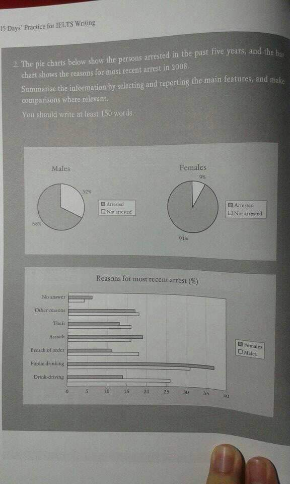
The pie chart indicates the proportion of capture in two genders in the past five years. While the bar chart illustrates the reasons for the arrested person in 2008
In general, the arrested percentage was more double than free percentage in both two sex. Furthermore, the man was arrested more than woman in 2008.
Initially, the past five years, the percentage of arrested males made up more twice than free males. Similarly, it was witnessed that the percentage of arrested females was near tenfold higher than not arrested. In addition, the percentage of arrested females was higher than males.
As for the bar chart, public drinking was the most reason for arrested cases in both two genders with over 35 percents for females and over 30 percents for males. Moreover, While the man was caught by some reasons such as theft, breach of order, drink-driving and other reasons. Reasons for females were no answers, assault, and public drinking.
Top answer
This is not a good exercise for Task 1. The instructions are not native English. For the pie chart, it is unclear that being suspected of a crime, these people were stopped by the police, and either let go, or arrested.
- This is not a good exercise for Task 1.
- The instructions are not native English.
- For the pie chart, it is unclear that being suspected of a crime, these people were stopped by the police, and either let go, or arrested.
- That is my assumption.
- The numbers in the bar graph do not add up to 100% for each gender and they should.
Get the Weekly English Kit 📬
New words, one handy idiom, and a 2-minute quiz — delivered to your inbox to keep your streak alive.
This is not a good exercise for Task 1.
The instructions are not native English. For the pie chart, it is unclear that being suspected of a crime, these people were stopped by the police, and either let go, or arrested. That is my assumption.
The numbers in the bar graph do not add up to 100% for each gender and they should.
If I were you, I would pick a different topic.
 Related Questions