
Ielts writing task 1 (please help me to correct this essay)
The chart given illustrates the average number of cars used by each 1000 citizens in 5 countries and Europe in 2005, 2009 and 2015.
Overall, among 5 countries, cars were driven the most in Germany, while the opposite was true for Greece. Also, in all countries, there was no considerable change over the period shown.
Obviously, starting at the lowest level, (300 cars) in 2005, the figure for Greece experienced a slight growth to 400, before declining to the previous data . Also, there was the clear stability in the number of car in France, at 700 in all three years. O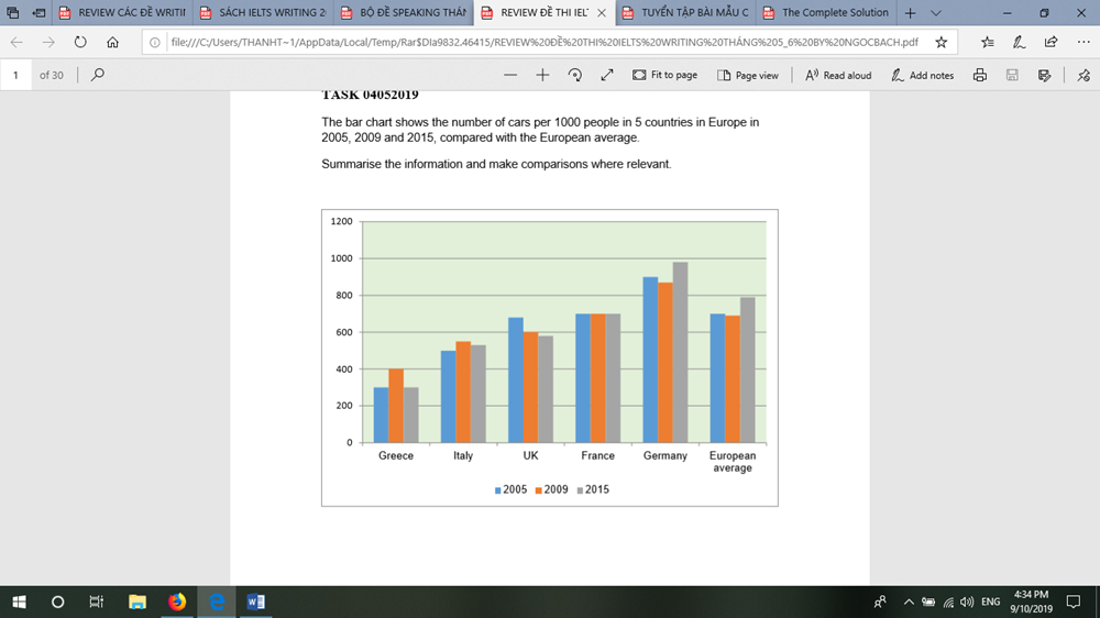
n the other hand, during the period, cars used by UK residents went down considerably, from 700 to under 600.
Focusing on the remaining patterns, in 2005, 900 cars were used by 1000 people, which was followed by an increased to 1000 in 2015, standing at the highest position. The similar trend was also witnessed in the figure for Italy and Europe average, beginning with 500 and 700, fishing at 550 and 800 respectively.
Top answer
Please read my advice for Task 1 essays. ) chart given illustrates (Wrong word. Illustrate means make a picture.
- Please read my advice for Task 1 essays.
- ) chart given illustrates (Wrong word.
- Illustrate means make a picture.
- It is good for process maps and diagrams.
- ) and Europe in 2005, 2009 and 2015.
Get the Weekly English Kit 📬
New words, one handy idiom, and a 2-minute quiz — delivered to your inbox to keep your streak alive.
Please read my advice for Task 1 essays. IELTS TASK 1: Hints, Tips And Advice
The (What kind of chart?) chart given illustrates (Wrong word. Illustrate means make a picture. It is good for process maps and diagr
 Related Questions