
IELTS WRITING Task 1 - Please help me check my essay
The bar chart shows the scores of team A, B and C over four different seasons.
Summarize the information by selecting and reporting the main features and make comparisons where relevant.
Write at least 150 words.
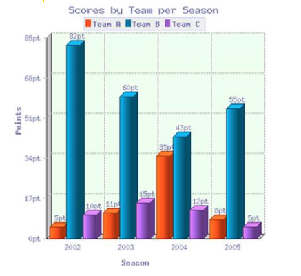
The chart compares three different teams in terms of the scores from 2002 to 2005.
Overall, it is clear that all the scores fluctuated over the period shown. Despite the variation, team B always had the highest scores.
In the first season of the period, team B achieved 82 points which was its highest total during four seasons. In contrast, the scores of team A and C at the same time were much lower, at 5 points and 10 points respectively. In the two following years, 2003 and 2004, the scores of team A increased dramatically to 35 points and those of team C slightly fluctuated to 12 points whereas the scores for team B experienced a significant decline from their peak to their trough at 43 points in 2004.
There were a rise in the team B score to 55 points in 2005. On the other hand, team A saw a considerable fall in its score to 8 points, even so the points scored was still a bit higher than that of team C with 5 points.
(178 words)
Top answer
The chart compares three different teams in terms of the scores from 2002 to 2005. ) over the period shown. Despite the variation , (Incorrect transition.
- The chart compares three different teams in terms of the scores from 2002 to 2005.
- ) over the period shown.
- Despite the variation , (Incorrect transition.
- ) team B always had the highest scores.
- In the first season of the period, team B achieved had / got / scored / 82 points which was its highest total during the four seasons.
Get the Weekly English Kit 📬
New words, one handy idiom, and a 2-minute quiz — delivered to your inbox to keep your streak alive.
The chart compares three different teams in terms of the scores from 2002 to 2005.
Overall, it is clear that all the scores fluctuated (Would you expect the teams to score exactly the same number of points every year?) over the period shown. Despite the variation, (Incorrect transition.
 Related Questions