
IELTS writing task 1 - Please help me check
-----------------
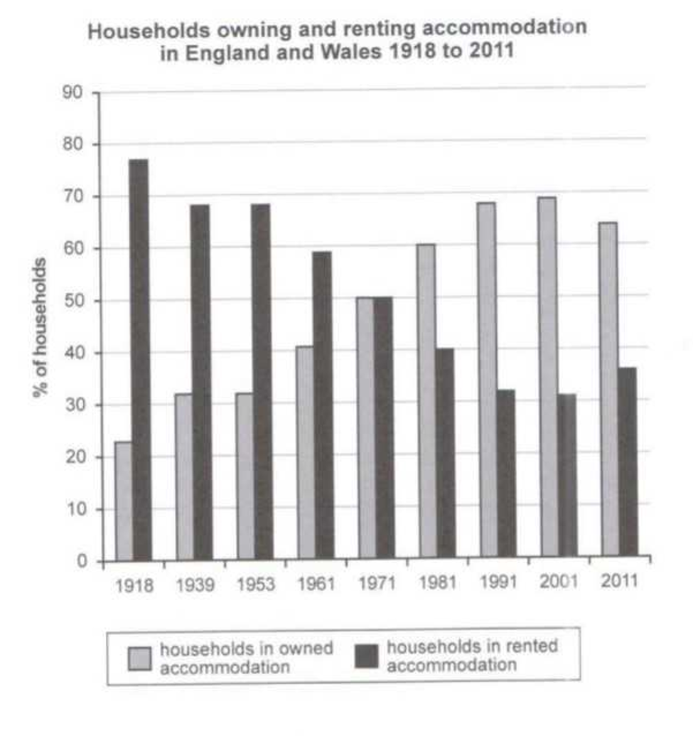
The bar chart compares the proportion of the English and Welsh families which bough house and rented house from 1918 to 2011.
Overall, almost English and Welsh households lived in rented house in 1918. Over 90 years, in 2011, more than 50 percent of population owned accommodation in English and Wales.
First of all, in 1981, the percentage of households in rented accommodation was the highest, nearly 80% and the percentage of households in owned accommodation was the lowest, at about 22%. Besides, there was a dramatic decrease in the households in rented house and a dramatic increase in the households in owned house in 1971. They had the same proportion was 50%.
Furthermore, in 2001, the percentage of families which owned house slightly grew but the figure for it was the highest, almost 70%. Also, the percentage of families which rented house was the lowest and stood at 31%. In the next year, the proportion of households in owned accommodation dropped to 65%, while that of household in rented accommodation rose somewhat around 35%
Top answer
The bar chart compares the proportion of the English and Welsh families which bough a house and rented house from 1918 to 2011. (That is not correct. ) Overall, almost English and Welsh households (wrong usage.
- The bar chart compares the proportion of the English and Welsh families which bough a house and rented house from 1918 to 2011.
- (That is not correct.
- ) Overall, almost English and Welsh households (wrong usage.
- There are rich households, and large households but there are no "almost households") lived in rented house housing in 1918.
- Over 90 years, in 2011, more than 50 percent of population (wrong word.
Get the Weekly English Kit 📬
New words, one handy idiom, and a 2-minute quiz — delivered to your inbox to keep your streak alive.
The bar chart compares the proportion of the English and Welsh families which bough a house and rented house from 1918 to 2011. (That is not correct. The chart does not plot purchases of accommodation, only the status of their living arrangements: rented o
The diagram reveals the percentage of houses which are rented and bought in two countries England and Wales in the years 1918 to 2011.
Overall, homes which are rented was dramatically increased in 1918 having almost 80%. Also the risest flats which were owned in 2001 were shown the highest percentage by almost 70%.
Beginning in 1918 the rented houses have slide away, coming by 50
 Related Questions