
Ielts Writing Task 1 - PLEASE CHECK THE GRAMMAR AND VOCABULARY, CORRECT IT AND ALSO GIVE ME AN ESTIMATE OF THE BAND SCORE FOR THIS ESSAY.
Task 1: The information below gives details about household income and spending on food and clothes by an average family in one UK city in 2010 and 2013.
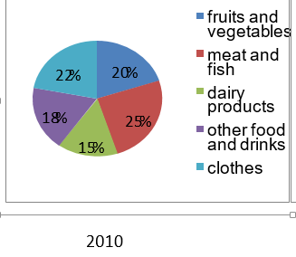
The tables compares the total income per household and their expenditure on food and clothes in a UK city in 2010 and 2013. The pie charts illustrate how spending on food and clothes were broken down into 5 different categories.
Overall, the total income by UK household felt in 2013; whereas, the spending on food and clothes increased from 2010. The proportion of fruits and vegetable rose in 2013.
In 2010, the amount of total income of UK family decreased by £4000 to £25,000 in period 2010 to 2013. However, the expenditure of them on food and clothes saw a slight increase, to reach 15,000 by 2013.
Taking this expenditure on food and clothes, the proportion of both clothes and meat and fish declined by 10%, to reach 12% and 15% respectively. In contrast, the proportion of other food and beverages remained stable throughout the given period.
Also, the figure for spending on fruits and vegetables and dairy products were slightly similar in 2010, at 20% and 15% respectively. Then, it saw a notable growth in the same category to 35% for the former and 20% for the latter by 2013.
191 words
Top answer
The tables compares the total income per household and their expenditure on food and clothes in a UK city in 2010 and 2013. ) different categories. ) I don't see any tables and there is only one pie chart.
- The tables compares the total income per household and their expenditure on food and clothes in a UK city in 2010 and 2013.
- ) different categories.
- ) I don't see any tables and there is only one pie chart.
- Please attach images of all the figures that you are writing about.
Get the Weekly English Kit 📬
New words, one handy idiom, and a 2-minute quiz — delivered to your inbox to keep your streak alive.
The tables compares the total income per household and their expenditure on food and clothes in a UK city in 2010 and 2013. The pie charts illustrate how spending on food and clothes, were broken down into 5 (If a nu
 Related Questions