
Ielts Writing Task 1- Pie Chart
Please help me correct my essay. Thank you in advance.
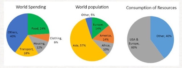
Topic: The pie charts below give data on the spending and consumption of resources by countries of the world and how the population is distributed. Write a report for a university lecturer describing the information shown below.
The three pie charts give information about the average spending on daily necessities, the demographic and the level of resources exploitation worldwide.
In overall, money allocated for food and other stuff is highest compared to transport and housing. Furthermore, although Asia has the highest population figure, yet USA and Europe are reported to outnumber other continents in terms of resources consumption.
In the first pie chart, ordinary folks are likely to spend more money on Others and Food Category, with 40% and 24% expenditure recorded respectively. While Transport and Housing observe less than 20% of spending worldwide.
As can be seen from the second and the third pie chart, Africa has the lowest figure for population density (10%), only one-sixth compared to Asia, which is the most crowded continent with more than a half (57%) of people residing in. Meanwhile, although accounting merely 14% each, Europe and America lead the world in terms of resources consumption, with 60% of materials used for both continents.
Top answer
Please read my advice for Task 1 essays: The three pie charts give information about the average spending on daily necessities, the demographic and the level of resources exploitation worldwide. That sentence makes no sense at all. You need to be much clearer.
- Please read my advice for Task 1 essays: The three pie charts give information about the average spending on daily necessities, the demographic and the level of resources exploitation worldwide.
- That sentence makes no sense at all.
- You need to be much clearer.
- What is the label on each pie chart?
- What categories are on each chart?
Get the Weekly English Kit 📬
New words, one handy idiom, and a 2-minute quiz — delivered to your inbox to keep your streak alive.
Please read my advice for Task 1 essays:
The three pie charts give information about the average spending on daily necessities, the demographic and the level of resources exploitation worldwide.
That sentence makes no sense at all. You need to be much clearer. What is the label on each pie chart? What categories are on each chart? How many are there an
 Related Questions