
Ielts writing task 1 (pie chart)
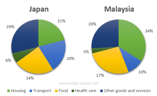
The pie charts below show the average household expenditures in Japan and Malaysia in the year 2010.
Summarise the information by selecting and reporting the main features, and make comparisons where relevant.
Average Household Expenditures by Major Category
MY REPORT
The pie charts provide the percentages of the residence spending in five categories: Housing, transport, food, health care and other goods and services in 2 countries: Japan and Malaysia in 2010.
Overall, in Japan the expenditure that had most percentages was other goods and services. In Malaysia, housing was spent most. Both Malaysia and Japan had the smallest segment of health care.
First, there was about 29% of expenditure that was used for other goods and services and 6% for health care in Japan. Both of them were higher than Malaysia 3%. About the transport, the Japanese spent for this category twice as Malaysian (approximately 20% in Japan).
Next, in Malaysia, the percentage of money that the people spent for food was more than Japan approximately 3%. About the housing, the Malaysian paid more than one-third for it compared to about one-fifth in Japan.
Thanks for checking for me.
Top answer
At 144 words, the report is under the required length of 150 words. It is best to write at least ten per cent over length, to ensure the submission is not penalized. The two pie charts provide the percentages [ a breakdown ] of the residence household* spending in Japan and Malaysia in 2010.
- At 144 words, the report is under the required length of 150 words.
- It is best to write at least ten per cent over length, to ensure the submission is not penalized.
- The two pie charts provide the percentages [ a breakdown ] of the residence household* spending in Japan and Malaysia in 2010.
- There are five categories: H ousing, transport, food, health care and other goods and services in 2 countries: in Japan and Malaysia in 2010 .
- Overall, in Japan the expenditure that had most percentages was other goods and services.
Get the Weekly English Kit 📬
New words, one handy idiom, and a 2-minute quiz — delivered to your inbox to keep your streak alive.
At 144 words, the report is under the required length of 150 words. It is best to write at least ten per cent over length, to ensure the submission is not penalized.
The two pie charts provide the percentages [a breakdown] of the
 Related Questions