
Ielts writing task 1 (pie chart)
The charts below show the reasons why people travel to work by bicycle or by car.
Summarise the information by selecting and reporting the main features, and make comparisons where relevant.
MY REPORT
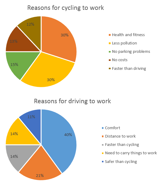
The pie charts provide the information about the reasons why people choose the vehicle (bicycle or car) to go to work in percentages.
Overall, the Health and Fitness and the less pollution reasons are the biggest sector of the reasons for cycling to work and the reason that contributes least to the chart was no costs. Next, the most reason why people choose car to get their working place because it is more comfortable and the reason that is safer than cycling makes up the smallest part of the chart.
First, both the reasons: Health and fitness and less pollution contribute the most to chart (about 30%). The other reasons comprise of faster than driving, no costs and no parking problems are 12%, 13% and 15% respectively.
Next, the comfort reason is the most reason why people go to work by car (approximately 40%). Nearly one-fifth of the people choose car because of distance to work (21%). The two reasons include in need to carry things to work and faster than cycling are both 14%. The reason of safer than cycling was the smallest segment: 11%.
Thank you so much for checking it for me.
Top answer
The pie charts provide the information about the reasons why people choose either a the vehicle ( bicycle or a car to go to work . in percentages. Suggestion: The pie charts provide a breakdown of the reasons that people give for their choosing a bicycle or a car to get to work.
- The pie charts provide the information about the reasons why people choose either a the vehicle ( bicycle or a car to go to work .
- in percentages.
- Suggestion: The pie charts provide a breakdown of the reasons that people give for their choosing a bicycle or a car to get to work.
- The percentages of five categories are shown in each chart.
- Overall, the Health and Fitness and the less pollution reasons are the biggest sector of the reasons for cycling to work and the reason that contributes least to the chart was no costs.
Get the Weekly English Kit 📬
New words, one handy idiom, and a 2-minute quiz — delivered to your inbox to keep your streak alive.
The pie charts provide the information about the reasons why people choose either a the vehicle ( bicycle or a car to go to work. in percentages.
Suggestion:
The pie charts provide a breakdown of the reasons that people give for their choosing a bicycle or a car to get to work. The percentages of five categories are s
 Related Questions