
IELTS WRITING TASK 1 - PIE CHART
The charts show how tourism to two countries changed over a 50-year period.
Summarise the information by selecting and reporting the main features, and make comparisons where relevant.
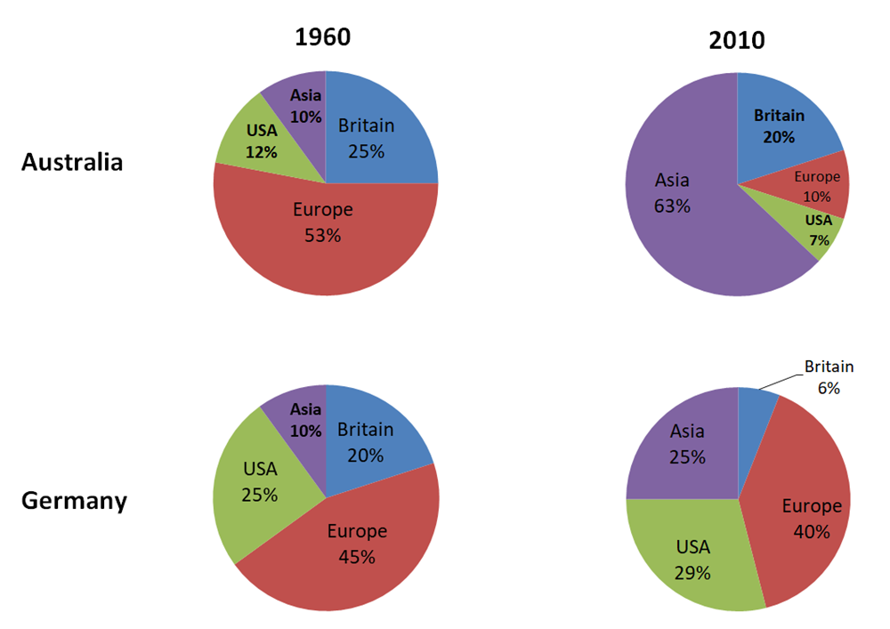
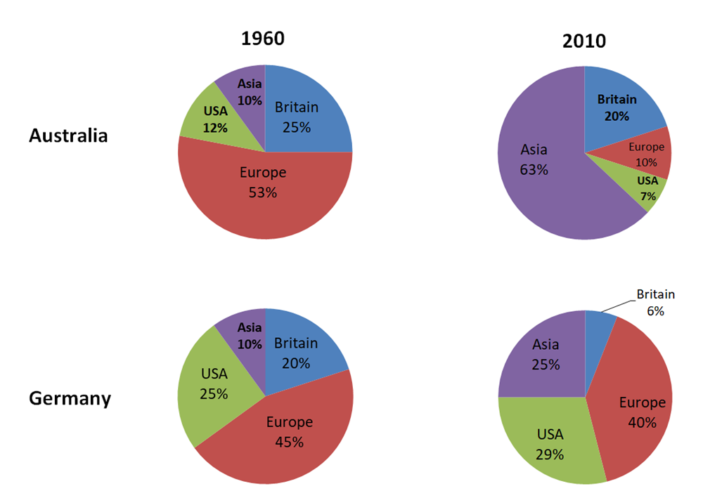
The four pie charts make a comparison of the changes in the numbers of Asian, USA, European, and British tourists to Australia and Germany between 1960 and 2010. Overall, the proportion of Asian tourists in Australia experienced a significant increase while the proportion in the number of tourists to from four regions to Germany correlated positively from 1960 to 2010.
Regarding the percentages of tourism from Asia, starting at only a tenth in both two countries in 1960, these figures witnessed an increase to 63 and 25 percent in Australia and Germany respectively. In contrast, the number of European tourists in Australia, which counted for 53 percent in 1960, decreased significantly to a tenth while these figures in Germany dropped from 45 percent to two-fifths throughout the period.
By contrast, the numbers of British tourists in Australia and Germany accounted for 25 percent and 20 percent respectively in 1960, they decreased to a-fifth in Australia and only 6 percent in Germany during the period. The figures for the USA to Australia dropped slightly from 12 percent to 7 percent while these data in Germany witnessed an increase from 25 percent to 29 percent from 1960 to 2010.
Top answer
Is it number of tourists or proportion......
- Is it number of tourists or proportion......
Get the Weekly English Kit 📬
New words, one handy idiom, and a 2-minute quiz — delivered to your inbox to keep your streak alive.
 Related Questions