
IELTS Writing Task 1 - Mixed charts
The pie chart below shows where energy is used in a typical Australian household, and the table shows the amount of electricity used according to the number of occupants.
Summarize the information by selecting and reporting the main features, and make comparisons where relevant. Write at least 150 words.
The pie chart and the table provides information about the distribution of energy use in an average Australian household and the consumption of electricity based on the number of members in the households.
Overall, it is clear that households in Australia used energy mainly for the purpose of heating and cooling. Additionally, the amount of electricity used per capita reduces as the number of people in the house increases.
Looking at the pie chart, heating and cooling makes up the largest proportion of the total household energy consumption, at 38%. Likewise, water heating was also a major purpose of using energy, registering a quarter of the total energy use. By contrast, Australian households use only 16% for other appliances, 7% for lighting and cooling each, compared to negligible figures of cooking and stand-by power purposes.
Turning to the table, 5,000 to 6,500 kWh was consumed in the family of only one person, as opposed to the electricity consumption of 12,000 to 16,000 kWh in household consisting 6 or more members, which is equivalent to just 2000 kWh to around 2,600 kWh per person.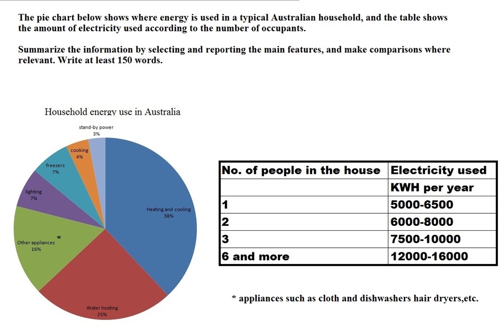
Get the Weekly English Kit 📬
New words, one handy idiom, and a 2-minute quiz — delivered to your inbox to keep your streak alive.
 Related Questions