
[IELTS writing task 1 - line graph] Please review my essay
Hi AlpheccaStars,
Please review my IELTS writing task 1 - line graph.
Thank you very much!
----------------------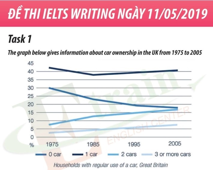
The line graph plots the car ownership levels of households in the UK from 1975 to 2005.
Overall, the households owning one car accounted for the highest proportion and the number for who owned more than three cars was smallest over the entire period. Also, the proportion of households having one car and no car decreased, whereas those for who owned more than two cars increased.
In 1975, forty-two percent of households owned one car, which was much higher than that of who had no car, with only 30 percent. Over the following 30 years, that of the former fell to around 30 percent in 1985 before slightly rising to approximately 41 percent in 2000, while that of the later decreased gradually by around 13% by the end of the period.
From 1975 to 2005, there was a linear increase in the proportion of households who had more than three cars from roughly 3 percent to roughly 7.5 percent. Similarly, the number for who owned two cars increased significantly by 10 percent.
Top answer
The line graph plots the car ownership levels (That is not a good description of this graph. ) of households in the UK from 1975 to 2005. Suggestions: The line graph plots the percent of households in the UK by the number of cars they owned from 1975 to 2005.
- The line graph plots the car ownership levels (That is not a good description of this graph.
- ) of households in the UK from 1975 to 2005.
- Suggestions: The line graph plots the percent of households in the UK by the number of cars they owned from 1975 to 2005.
- Specifically, there are four curves: those who had no car, one car, two cars and three or more cars.
- Overall, the proportion of the households who possessed one car was the highest and was relatively constant, staying in the narrow range between 38 and 42 percent.
Get the Weekly English Kit 📬
New words, one handy idiom, and a 2-minute quiz — delivered to your inbox to keep your streak alive.
The line graph plots the car ownership levels (That is not a good description of this graph. What is on the graph, exactly?.) of households in the UK from 1975 to 2005.
Suggestions:
The line graph plots the percent of households in the UK by the number of cars they owned from 1975 to 2005. Specifically, there are
 Related Questions