
IELTS WRITING TASK 1 ( Line Graph). I don't have anyone to help me correct the essay. Could someone kindly check it, please? If it's possible, may you give me a mark? Thank you so much!
Topic: The graph below shows the percentage of Australian exports to 4 countries from 1990-2000. Summarise the information by selecting and reporting the main features, and make comparisons where relevant.
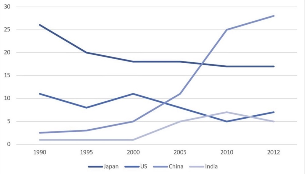
The line graph below illustrates the proportion of Australian goods to 4 countries for sales (Japan, the US, China, and India) between 1990 and 2012.
It is clear that the proportion of Australian products to China and India for sales increased, while the figures for Japan and the US had the opposite trend. In addition, China was the country that had the most significant imports from Australia over the period.
In 1990, there were roughly 3% of exports from Australia to China, after which this figure went up gradually to 5 percent in 2000. At the same time, the number of exports to Japan was about 9 times higher than those to China. The proportion of those to China grew dramatically and then reached a peak of nearly 30%. However, Japan saw a noticeable decrease in the figures of those at around 17% during the 21 years left.
There was a fluctuation in the percentage of exports to the US approximately 12% and 7% over the 22-year period. Standing at 0%, India did not experience any growth during the 10 years since 1990. The imports of India from Australia rose by around 7%, followed by a sharp fall to 5% in 2012.
Top answer
Please post essays, paragraphs, dialogues and other writing in the essay forum so a moderator does not have to move your post. htm --------------------- Please read my advice for Task 1 essays: IELTS TASK 1: Hints, Tips And Advice Vocabulary Words For Task 1: Reference Post
- Please post essays, paragraphs, dialogues and other writing in the essay forum so a moderator does not have to move your post.
- htm --------------------- Please read my advice for Task 1 essays: IELTS TASK 1: Hints, Tips And Advice Vocabulary Words For Task 1: Reference Post
Get the Weekly English Kit 📬
New words, one handy idiom, and a 2-minute quiz — delivered to your inbox to keep your streak alive.
Please post essays, paragraphs, dialogues and other writing in the essay forum so a moderator does not have to move your post.
https://www.englishforums.com/English/EssayReportCompositionWriting/Forum9.htm
---------------------
Please read
Thái Nguy?nTopic: The graph below shows the percentage of Australian exports to 4 countries from 1990-2000. Summarise the information by selecting and reporting the main features, and make comparisons where relevant.
The task does not match the figure! That is very
The line graph below (It is unnecessary to describe where it is.) illustrates (wrong verb. Read my advice. I list the verbs to use in task 1.) the proportion of Australian goods (not a good expression) that were exported to
Here is a sample essay for you to study.
The graph compares the percentages of all Australian exports that were destined to Japan, India, China, and the USA over the twenty-two year period, 1990-2012.
Overall, the share of exports that these countries received increased over the period, and that was primarily due to the large jump in exports to China after 2005. Besides China,
I tried to re-write your paragraphs as closely as possible to what you wrote. It is not easy to follow your logic. It is not very cohesive.
In 1990, there were roughly 3% of all exports from Australia went to China, after which it (Use pro
 Related Questions