
[IELTS Writing Task 1] Line graph - Help me correct this please!
The graph below shows the consumption of fish and different kinds of meat in a European country between 1979 and 2004.
Summarise the information by selecting and reporting the main features and make comparisons where relevant.
Write at least 150 words.
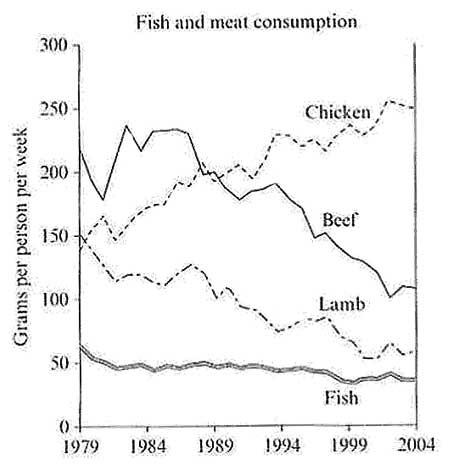
The line graph indicates the amount of fish and some other types of meat consumed in a European country in a period of 25 years.
Overall, while chicken consumption followed an upward trend, other three categories showed a downward one. However. However, fish’s figure decreased much more slowly.
Starting at about 140 grams in 1979, chicken consumption per person per week fluctuated throughout the period but showed a slight downward trend, from 52 to 49 grams in 2004.
Beef and lamb consumption’s figures showed an obvious similarity in trend and decreasing amount. Although beef’s one started at a higher amount, 220 grams, than lamb’s one, 150 grams, both decreased by about 90 grams after 25 years.
Top answer
The line graph [ 1] indicates / compares the weekly amount , in grams, of fish and some other types of meat consumed per capita in a European country in a period of 25 years starting in 1979 . Overall, while chicken the consumption of chicken rose slightly and that of fish fell somewhat, followed an upward trend, the other three two categorie s, lamb and beef, showed experienced a clear downward trend. one.
- The line graph [ 1] indicates / compares the weekly amount , in grams, of fish and some other types of meat consumed per capita in a European country in a period of 25 years starting in 1979 .
- Overall, while chicken the consumption of chicken rose slightly and that of fish fell somewhat, followed an upward trend, the other three two categorie s, lamb and beef, showed experienced a clear downward trend.
- one.
- However.
- However, fish’s figure decreased much more slowly.
Get the Weekly English Kit 📬
New words, one handy idiom, and a 2-minute quiz — delivered to your inbox to keep your streak alive.
The line graph [ 1] indicates/compares the weekly amount, in grams, of fish and some other types of meat consumed per capita in a E
 Related Questions