
IELTS Writing Task 1: line graph
Dear teacher,
Please help me check and give some feedback on this essay,
Thank you,
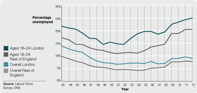
The graph below shows changes in young adult unemployment rates in England between 1993 and 2012.
The line graph illustrates how the proportion of unemployment of people who aged from 16 to 24 years in England changed in the period of 20 years from 1993 to 2012.Overall, while the percentage of young adults who were jobless in England showed a fluctuating leapfrog, the overall rate of adults without job indicated a slight dip.
In 1993, level of joblessness in 16 to 24-year-old English living in London took the lead, with roughly 22%, which was 5% higher than that of those living in the rest of England. Both figures then experienced a significant decrease and reached their rock bottom at 15% and 11% in 2002 and 2004 respectively. Luckily, they gathered pace and made a recovery to increase steadily in the remainder of the surveyed period. (It is noted that the proportion of young adults living in the capital was merely higher than that of dwellers living outside London)
In the year of 1993, the overall adult unemployment rate in London accounted for 14%, which was slightly higher than its counterpart-the rate in the rest of England, a difference of 4%. A striking similarity is that these figures then had a significant decrease in the 10 consecutive years and were below 10% at the end of the survey.
Top answer
" It is good for maps, process flow charts, diagrams and other types of figures with images. ) how the proportion of unemployment of people who aged from 16 to 24 years (wrong expression. ) in England changed in the period of 20 years from 1993 to 2012.
- " It is good for maps, process flow charts, diagrams and other types of figures with images.
- ) how the proportion of unemployment of people who aged from 16 to 24 years (wrong expression.
- ) in England changed in the period of 20 years from 1993 to 2012.
- ) Suggestion: Opening paragraph - describe clearly the four different curves on the graph.
- The line graph compares unemployment percentages of young people with the general population in two geographical areas, London and the rest of England, between 1993 and 2012.
Get the Weekly English Kit 📬
New words, one handy idiom, and a 2-minute quiz — delivered to your inbox to keep your streak alive.
The line illustrates (Illustrate is "make a picture." It is good for maps, process flow charts, diagrams and other types of figures with images. It is not good for graphs, bar charts, pie charts and tables.) how the proportion of unemployment of people
 Related Questions