
Ielts writing task 1 line graph
The graph below gives information about international tourist arrivals in five countries.
Summarise the information by selecting and reporting the main features, and make comparisons where relevant.
MY REPORT
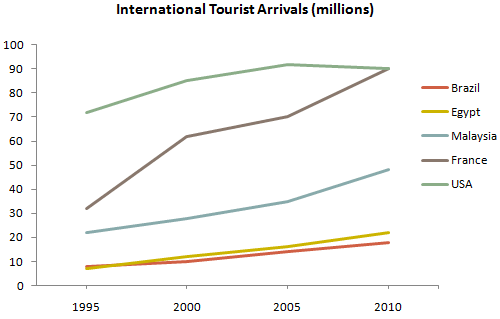
The line graph supplies information about the number of the international tourist that visited in five countries: Brazil, Egypt, Malaysia, France and USA between 1995 and 2010. The unit digit was used in this graph to count the people was in millions people.
Overall, almost the five countries in this graph had increased for the whole time except for USA because of its small decreasing from 2005 to 2010. The most developing country was France because in 1995, France was just in second position from high to low but after 15 years, the number of international tourist increased very fast and became the country with the most international tourists with USA. The international tourism in Egypt and Brazil also developed too but they just rose gradually.
First, in 1995, USA was the most visited countries when there were about 70 millions of people that visited it. That number equalized with the sum of the other countries in that year. After 10 years, the number kept increasing and reached about 90 millions. However, it was declined slightly to approximately 85 million. Next, in the first year, there were just about more than 30 millions of international tourists. But after 10 years of rocket increasing, the gap between France and USA was about 20 millions. In 2010, there was no gap between France and USA.
In Malaysia, there were about 21 millions of international visitors and that number increased steadily for the whole period and reached about 48 million in 2010. In the last two countries, Egypt and Brazil, they had almost the same number of international tourists in 1995 (approximately 8 millions) and their international tourism both increased gradually. And in 2010, there were about 18 million international tourists in Egypt, higher than Brazil approximately 2 million.
Thanks for helping me.
Top answer
The line graph supplies information about (It does not give general information about this subject. It gives the numbers. ) plots the number of the international tourist (wrong form) that visited in five countries: Brazil, Egypt, Malaysia, France and USA between 1995 and 2010.
- The line graph supplies information about (It does not give general information about this subject.
- It gives the numbers.
- ) plots the number of the international tourist (wrong form) that visited in five countries: Brazil, Egypt, Malaysia, France and USA between 1995 and 2010.
- ) was used in this graph to count the people was in millions people.
- Overall, the international arrivals in almost all the five countries in this graph had increased for the whole time except for USA because of its small decrease / decline / drop decreasing from 2005 to 2010.
Get the Weekly English Kit 📬
New words, one handy idiom, and a 2-minute quiz — delivered to your inbox to keep your streak alive.
The line graph supplies information about (It does not give general information about this subject. It gives the numbers. ) plots the number of the international tourist (wrong form) that visited in five countries: Brazil, Egypt, Malaysia, France and USA between 1995 and 2010.
 Related Questions