
Ielts writing task 1 (line graph)
The line graph below shows the percentage of tourists to England who visited four different attractions in Brighton.
Summarise the information by selecting and reporting the main features, and make comparisons where relevant.
MY REPORT
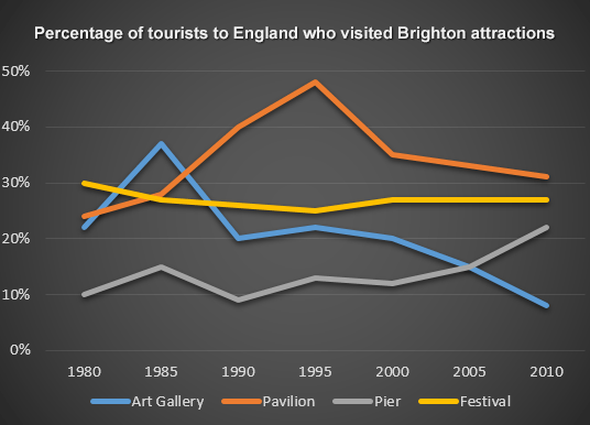
The line graph provides the rates of tourists that had visited in four Brighton distinct attractions: Art Gallery, Pavilion, Pier, Festival from the year 1980 to 2010.
Overall, the number of tourists that visited Pavilion increased rapidly for 15 years but after that it declined very fast too. Art Gallery was in the same situation with Pavilion too, from 1980 to 1985 it rose up considerably but then it decreased more than the percentages than it had increased. The rates of the Festival’s tourists decreased a few percentages with some fluctuation. Pier was just like Festival too but the difference between them was it had increased instead of decreasing.
First, from 1980 to 1995, the proportion of Pavilion’s tourists doubled (about 48%). It was the most popular destination for tourism in Brighton in the year 1995. However, it continuously decreased until 2010 when it was decreased by about 17% but it was still the most famous one compared to the others. Second, in the first 5 years, the proportion of the tourist that came to Art Gallery increased by approximately 16% and its percentage was about 38% in 1995 and it was the most famous destination for tourist to visit. Unfortunately, it also declined sharply and its low point was about 8% in the last year and it was the least famous place.
Next, the rate of the tourist that came to Festival declined from about 30% to 25% in the first 15 years. Then it increased to approximately 27% and remained until 2010. Last, the tourist’s percentage visited Pier increased from 1980 to 1985 and then decreased with the same proportion. After that, it constantly increased and reached about 22% in 2010.
Thanks for helping me. I know that I have written too many words but there is too much information. I really don't know how to summarize it. Please help me. Thank you very much
Top answer
The line graph provides the rates (Why did you use the word "rate" when there are no rates on the graph? ) of tourists that had visited in four Brighton distinct attractions: Art Gallery, Pavilion, Pier, and Festival from the year 1980 to 2010. Overall, the number of tourists that visited Pavilion increased rapidly for the first 15 years but after that it declined very fast too.
- The line graph provides the rates (Why did you use the word "rate" when there are no rates on the graph?
- ) of tourists that had visited in four Brighton distinct attractions: Art Gallery, Pavilion, Pier, and Festival from the year 1980 to 2010.
- Overall, the number of tourists that visited Pavilion increased rapidly for the first 15 years but after that it declined very fast too.
- Art Gallery was in the same situation with Pavilion too, from 1980 to 1985 it rose up (You have made this vocabulary mistake before.
- "Rise up" is not a good phrasal verb here.
Get the Weekly English Kit 📬
New words, one handy idiom, and a 2-minute quiz — delivered to your inbox to keep your streak alive.
The line graph provides the rates (Why did you use the word "rate" when there are no rates on the graph? The graph shows percentages, not rates, and they are different measures.) of tourists that had visited in four Brighton distinct attractions: Art Gallery, Pavilion, Pier,
 Related Questions