
Ielts writing task 1 (line graph)
The graph below shows the pollution levels in London between 1600 and 2000.
Summarize the information by selecting and reporting the main features, and make comparisons where relevant.
MY REPORT
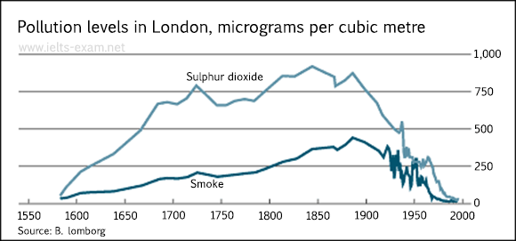
The line graph provides information about the pollution levels of 2 things: Sulphur dioxide and smoke from 1600 to 2000 in London. These pollutants were measured in micrograms per cubic metre.
Overall, both Sulphur dioxide and smoke levels increased with some fluctuation. Sulphur dioxide level got the highest around 1835 and the highest level of smoke was around 1880. Then, they both decreased quite sharply and became almost nonexistent before the year 2000.
First, the density of Sulphur dioxide was about 200 micrograms in one cubic meter and it grew to approximately 650 micrograms and remained for about 30 years. Then, it increased rapidly (about 800 micrograms) but it declined considerably intermediately with the same amount that it had risen up. However, it increased again with some fluctuation until it got the highest amount (approximately 800 micrograms) before 1930. Gradually, it had decreased with a lot of fluctuation (especially from 1930 to 1970) and finally declined to almost zero micrograms in the last year of the period
The smoke density of smoke was just about 100 micrograms in 1600. After that, it increased quite fast with some fluctuation until before the 1900 (around the time when the Sulphur dioxide’s level was highest) when its highest level was about 450 micrograms per cube meter. It also decreased considerably with a lot of fluctuation at the same time with Sulphur dioxide and reached the nonexistent level around the year 2000 too.
Thank you very much for your help.
Top answer
Note: There is one period of fluctuation in your graph. That was in the period from 1920 to 1960, with a declining trend curve. The other periods showed relatively steady trends with minor variations, either increasing or decreasing.
- Note: There is one period of fluctuation in your graph.
- That was in the period from 1920 to 1960, with a declining trend curve.
- The other periods showed relatively steady trends with minor variations, either increasing or decreasing.
- Look at the graphs below to learn to recognize fluctuation: 1 Cyclical (regular, seasonal) fluctuation: 2.
- Random fluctuation Also, learn the word correlation .
Get the Weekly English Kit 📬
New words, one handy idiom, and a 2-minute quiz — delivered to your inbox to keep your streak alive.
Note:
There is one period of fluctuation in your graph. That was in the period from 1920 to 1960, with a declining trend curve. The other periods showed relatively steady trends with minor variations, either increasing or decreasing.
Look at the graphs below to learn to recognize fluctuation:
1 Cyclical (regular, seasonal) fluctuation:
The line graph provides information about measurements of the atmospheric concentration pollution levels of two pollutants, things: Sulphur dioxide and smoke, from 1600 to 2000 in London. These pollutants were measured in micrograms p
 Related Questions