
IELTS Writing Task 1 Line Graph
Please review it, thank you!
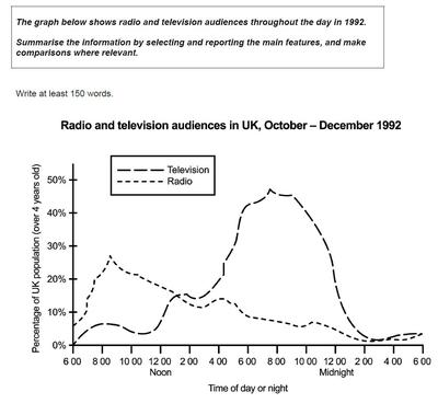
The line graph illustrates the percentage of audiences of radio and television at each time of the day in the UK from October to December in 1992.
Overall, majority of audiences in the UK prefer to listen to radio in the morning whereas most of them watch television in the evening. Over the 24 hours, the proportion of people watching television is more than listening to radio.
There was a sharp increase in the percentage of people listening to radio from under 10% to nearly 30% between 6am and 9am. Then, it declined gradually to 2am in the next morning from the highest point to only 1% and remained at that level until it rose again at 5am.
Regarding to TV, there was no one watching TV at 6am, then, the percentage of television audiences increased slightly to about 14% at 3pm. Dramatically, that of those climbed to the highest point at approximately 45% at 8pm. However, after 9pm, it fell sharply to under 5% and remained to 6am.
Top answer
The line graph illustrates the percentage of audiences (incorrect. That is not what is plotted on the graph. g.
- The line graph illustrates the percentage of audiences (incorrect.
- That is not what is plotted on the graph.
- g.
- 400) of radio and television at each time of the (incorrect expression.
- That would be a scatter plot of points) day in the UK from October to December in 1992.
Get the Weekly English Kit 📬
New words, one handy idiom, and a 2-minute quiz — delivered to your inbox to keep your streak alive.
The line graph illustrates the percentage of audiences (incorrect. That is not what is plotted on the graph. If the total audience was 1000 people, it might plot 40% of them, e.g. 400) of radio and television at each time of the (incorrect expression. That would be a scatter plot of points)
 Related Questions