
[IELTS WRITING TASK 1] : LINE GRAPH
Pls help me check this one! Thank you so much for paying attention to my post
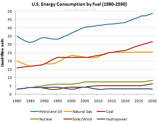
The graph below gives information from a 2008 report about consumption of energy in the USA since 1980 with projections until 2030.
Summarise the information by selecting and reporting the main features, and make comparisons where relevant.
The graph illustrates how the USA energy, especially fuel, was reported to be consumed in 50-year period of time from 1980 to 2030.
At first glance it is clear that the graph can be divided into three distinctive group in which every fields indicate the almost equal number of consumption. In addition, most of the feature was anticipated to represent a rising pattern for 50 years since 1980.
The most out-standing feature is that the amount of petrol and oil was, in 1980, at the highest starting point, exactly 35 quadrillion units which was over twice and seven times as high as coal and the group of renewable energy resources, respectively. The petrol and oil consumption have seen light fluctuated pattern, from 1980 to 1995 before reaching its predicted peak at nearly 50 quadrillion units in 2030.
The natural gas and coal consumption met at some particular points that one of them was the rock bottom of the natural gas at over 15% due to their reserved pattern during the time. No longer after that, in 1980s, hydropower, nuclear and solar usage splited into three distinguished lines in which hydropower was forecasted to be the most lowest-used feature in the future, reaching the same as the starting point, 5 quadrillion units.
Get the Weekly English Kit 📬
New words, one handy idiom, and a 2-minute quiz — delivered to your inbox to keep your streak alive.
 Related Questions