
IELTS Writing Task 1 - Line Chart
Hi,
Please help review my writing below and give me percent as grade if possible. For example, 60% if it's bad, 80% if it's ok or more if you're really like it. Many thanks.
The graph below shows the consumption of fish and some different kinds of meat in a European country between 1979 and 2004. Summarize the information by selecting and reporting the main features, and make comparison where relevant.
--
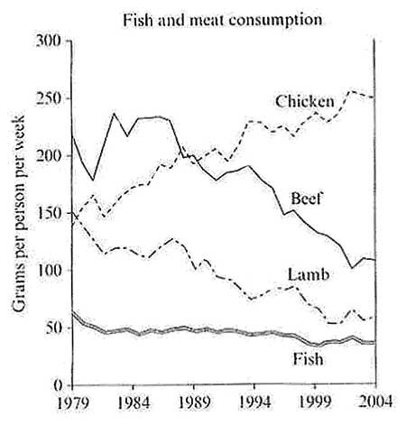
The chart illustrates how Europe’s people consumed chicken, beef, lamb and fish from 1979 to 2004.
At the first glance, it is clear that the amount of fish consumption is the lowest. Throughout time, European people ate more chicken while consuming trends for beef, lamb and fish was downward.
In 1979, most of people in Europe ate beef, about 220 grams weekly. They consumed chicken and lamp a bit less, 150 grams and 140 grams per week respectively. Fish consumption was the lowest, just around 60 grams per week.
From 1980s to 1990s, the consumptions for both beef and lamb went through considerably fluctuation with downward trends, dropped to 100 and 60 respectively in 2004. Albeit with this trend, chicken consumption was continuing raised and reached its peak at 260 grams per week; then slightly dropped to about 250 grams in 2004. Fish consuming was slightly fluctuated through times and decreased to about 40 grams per week the year 2004.
Get the Weekly English Kit 📬
New words, one handy idiom, and a 2-minute quiz — delivered to your inbox to keep your streak alive.
 Related Questions