
Ielts Writing Task 1: International Migration in UK
The graph shows Long-Term International Migration in the UK, 1999-2008.
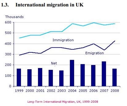
The chart provides the information about immigration, emigration anh net migration in the UK between 1999 and 2008.
Overall, the number of immigrants and emigrants gradually rose during the period, however, the figures for immgration was considerable higher. Net migration slightly fluctuated over the period and peaked in 2004 and 2007.
At the beginning of the period, there were over 450,000 people coming to reside in the UK whilst the quantity of people who emigrated was just about two thirds of that number. Net migration stood at around 160,000 people and it remained at a similar level until 2003 then peaked at nearly 250,000 people in 2004.
After 2004, the rate of immigration remained at a high level of nearly 600,000 people. Meanwhile, the number of emigrants experienced a sudden decrease in 2007, before reaching a peak at almost 420,000 people in 2008. Thus, net migration increased to a peak of 240,000 people in 2007 but then fell back to about 160,000 people in 2008.
Top answer
The chart provides the information about immigration, emigration anh net migration in the UK between 1999 and 2008. Immigration and emigration are shown as line graphs. The difference is shown as a bar chart.
- The chart provides the information about immigration, emigration anh net migration in the UK between 1999 and 2008.
- Immigration and emigration are shown as line graphs.
- The difference is shown as a bar chart.
- The units on the Y-axis are thousands.
- Overall, the number of both immigrants and emigrants gradually rose during the perio d, (comma splice error) however, the figures for immgration was considerable higher.
Get the Weekly English Kit 📬
New words, one handy idiom, and a 2-minute quiz — delivered to your inbox to keep your streak alive.
The chart provides the information about immigration, emigration anh net migration in the UK between 1999 and 2008. Immigration and emigration are shown as line graphs. The difference is shown as a bar chart. The units on the Y-axis are thousands.
Overall, the number of
The graph and bar chart illustrate the rising trend in migration to or from United Kingdom (UK) by plotting the figures in thousands for the period between 1999 and 2008.
Both immigration to and emigration from UK rose in the given ten years but the values in the former case remained higher in general. The number of immigrants to UK were ranging from 400,000 to 500,000 until 2001 when it
 Related Questions