
IELTS Writing Task 1 Inputs Needed (4)
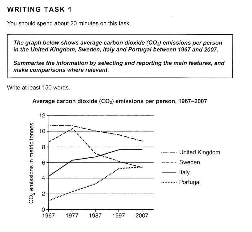
The line chart indicates the change of average number of Carbon dioxide (CO2) emissions per person measure in metric tonnes in 4 countries: United Kingdom, Sweden, Italy and Portugal from 1967 to 2007.
Overall these 4 countries had different average number of Carbon Dioxide emissions per person and in sort from highest to lowest: United Kingdom, Sweden, Italy & Portugal. The Carbon Dioxide emission per person in Italy & Portugal increase steadily whereas United Kingdom & Sweden tended to decrease the Carbon dioxide emissions, especially it can be observed a dramatic change in Sweden.
A glance at the graph provided reveals some striking similarities between the Portugal and Italy CO2 emission amounts during the period from 1967 to 2007.
It is evident that both nations saw a considerable increase in CO2 emission, with lowest during the 1967s and highest during the 2007s.
Emitting about more than 1 tonnes in 1967, the CO2 emissions in Portugal increased average 1 tonnes in every ten-year periods and reached highest point at about more than 5 tonnes in 2007. Italy also had the same upward trend as Portugal with the CO2 emissions lowest at more than 4 tonnes in 1967 and highest at about 8 tonnes in 2007.
In the other hand, United Kingdom and Sweden had a downward trend throughout the period. Yet the variation were different between the countries. The CO2 emissions in United Kingdom decreased gradually from nearly 11 tonnes in 1967 to 9 tonnes in 2007. Sweden saw a substantial fluctuation over the years when the CO2 emissions increased from nearly 9 tonnes in 1967 to over 10 tonnes in 1977. After that, in just 10 years, it dropped sharply to about 7 tonnes in 1987 and from there, the following 20 years kept a marginal decrease to 5 tonnes in 2007.
Top answer
The line chart (wrong word) indicates the change of average number (wrong word. The graph does not plot the average number of times each person emitted CO 2 . ) of Carbon dioxide (CO2) emissions per person measure (wrong form) in metric tonnes in 4 (wrong form) countries: the United Kingdom, Sweden, Italy and Portugal from 1967 to 2007.
- The line chart (wrong word) indicates the change of average number (wrong word.
- The graph does not plot the average number of times each person emitted CO 2 .
- ) of Carbon dioxide (CO2) emissions per person measure (wrong form) in metric tonnes in 4 (wrong form) countries: the United Kingdom, Sweden, Italy and Portugal from 1967 to 2007.
- "carbon dioxide" is a common noun.
- It is not capitalized.
Get the Weekly English Kit 📬
New words, one handy idiom, and a 2-minute quiz — delivered to your inbox to keep your streak alive.
The line chart (wrong word) indicates the change of average number (wrong word. The graph does not plot the average number of times each person emitted CO2. ) of Carbon dioxide (CO2) emissions per person measure (wrong form)
 Related Questions