
IELTS writing task 1 - Help me check it out please
The chart below shows how frequently people in the USA ate in fast food restaurants between 2003 and 2013.
---------
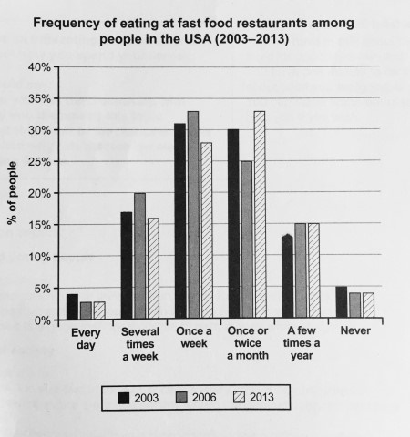
The bar chart depicts the rate of coming to fast food restaurants of American in three points of time which were 2003, 2006, and 2013, by the way, the bar’s unit is measured in percentage.
Overall, people in America seemed to come to fast food restaurants regularly in three years 2003, 2006, and 2013. Many Americans tended to eat at fast food restaurants once a week in 2006, but they frequently consumed fast foods there once or twice a month in 2013.
In 2003, there were over 31% of Americans came to fast food restaurants once a week and this figure went to about 33% three years later, in 2006. Nevertheless, in 2013, the percentage of people who ate in fast food restaurants every week significantly dropped to 27%. Besides, the figure for Americans who ate fast foods on the spot once or twice a week stood at 30%, however, it dramatically decreased to 25% in 2006 before reached to 33% in 2013.
On the other hand, the percentage of Americans eating at fast food restaurants every day was lowest, it was only 4% in 2003 and it went to 3% in both year 2006 and 2013. In addition, the rate of Americans who never ate at fast food restaurants was low too, in 2003, the figure for it was 5 in percentage, but lower in 2006 and 2013. The number was 4% in those two years.
Top answer
The bar chart depicts the rate of coming to fast food restaurants of American in three points of time which were 2003, 2006, and 2013 , by the way, (Never write phrases like "by the way" in Task 1) The y-axis is ba r’s unit is measured in percentage. The bar chart plots the relative frequency distribution for the number of times per year that Americans had a meal in a fast food restaurant. There is one data set for each of three years, 2003, 2006 and 2013.
- The bar chart depicts the rate of coming to fast food restaurants of American in three points of time which were 2003, 2006, and 2013 , by the way, (Never write phrases like "by the way" in Task 1) The y-axis is ba r’s unit is measured in percentage.
- The bar chart plots the relative frequency distribution for the number of times per year that Americans had a meal in a fast food restaurant.
- There is one data set for each of three years, 2003, 2006 and 2013.
- There are six categories, ranging from 365 (every day) to 52 (once a week) to 0 (never).
- Note: A relative frequency distribution is a special type of bar chart.
Get the Weekly English Kit 📬
New words, one handy idiom, and a 2-minute quiz — delivered to your inbox to keep your streak alive.
The bar chart depicts the rate of coming to fast food restaurants of American in three points of time which were 2003, 2006, and 2013, by the way, (Never write phrases like "by the way" in Task
The bar chart illustrates the frequency of USA citizens ate fast food from 2003 to 2013.
Generally speaking, most USA inhabitants ate fast food once a week or once twice a month while least inhabitants ate fast food every day. The habit of eating fast food did not show many fluctuation.
Regard with majority of population, more than 30% Americans claimed that they used to
 Related Questions