
IELTS writing task 1: food consumption
I'm preparing for the IELTS exam. Can you please review my essay? Thank you!
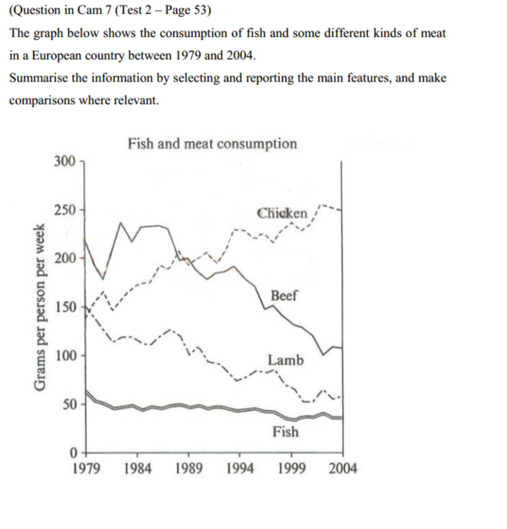
The line graph illustrates how much chicken, beef, lamb and fish was consumed in a Europe nation over the course of 25 years starting in 1979.
Looking at the graph, it is immediately obvious that all types of food experienced downward trends with the exception of chicken. Fish are the least favoured among the four food categories in this country.
In 1979, chicken consumption stood at under 150 grams per person per week. This figure rose to about 250 in 2004 after many minor fluctuations. An opposite trend was witnessed in the figure for lamb, which fell steadily from 150 in 1979 to over 50 in 2004.
After a number of fluctuations, the amount of consumed beef decreased significantly from about 240 grams per person per week in 1979 to under 100 in 2004. Over the same period, there was only a gradual reduction in the figure for fish, which went down from approximately 60 in 1979 to about 40 in 2004.
Top answer
The line graph illustrates how much chicken, beef, lamb and fish was consumed in a Europe nation (That is incorrect) over the course of 25 years starting in 1979. Looking at the graph, it is immediately obvious that (The examiner knows that you are looking at the graph. Don't tell them what they already know.
- The line graph illustrates how much chicken, beef, lamb and fish was consumed in a Europe nation (That is incorrect) over the course of 25 years starting in 1979.
- Looking at the graph, it is immediately obvious that (The examiner knows that you are looking at the graph.
- Don't tell them what they already know.
- Also words like "clear, evident and obvious" are your opinions.
- Do not write opinions in Task 1.
Get the Weekly English Kit 📬
New words, one handy idiom, and a 2-minute quiz — delivered to your inbox to keep your streak alive.
The line graph illustrates how much chicken, beef, lamb and fish was consumed in a Europe nation (That is incorrect) over the course of 25 years starting in 1979.
Looking at the graph, it is immediately obvious that (The examiner knows that you are looking at the graph. Don't tell them what they already know. Also w
 Related Questions