
IELTS Writing Task 1 Fast food Items
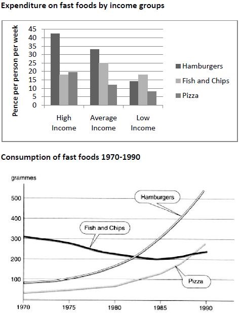
The chart below shows the amount of money per week spent on fast foods in
Britain. The graph shows the trends in consumption of fast foods.
Write a report for a university lecturer describing the information shown below.
You should write at least 150 words.
Expenditure on fast foods by income groups
My Report:
The given bar chart provides information about the weekly spending on buying Hamburgers, Fish and Chips, and Pizza by three different income groups in Britain, whereas the graph illustrates the varying trends in consuming fast foods during a period between 1970 to 1990.
AT first glance, it is evident that the High Income and the Average Income Britons are putting money the most in purchasing Hamburgers while the Low Income class is spending relatively less money on these three items and prefer buying Fish and Chips over Hamburgers and Pizza. Moreover, Hamburgers seems to be the most consumed fast food item towards the end of thestudy period, though it was less popular than Fish and Chips back in 1970.
Overall the spending on three fast food items is more in case of High Income group and Hamburgers are getting more attention to be purchased, even more than the total spending on the other two items together. Though Average Income people are putting less money on the purchase of these three food items but they are following a trend somewhat similar to the upper class in choosing the fast food except Fish and Chips; an item given more preference over Pizza by the Average income English. On the other hand, Fish and Chips is more popular when Low Income group shopped for fast food.
In 1970, Hamburgers and Pizza were eaten less than 100 grammes but the consumption increased towards the middle of the study period when a rise was observed in the consumption of both items, more considerable in case of former which surpassed the amount of Fish and Chips consumption after 1980 and crossed 500 grammes around 1990, a value four times higher as compared to the figures given for 1970.
Top answer
The given bar chart provides information about the compares three income groups in Britain in terms of their weekly spending on buying h amburgers, f ish and c hips, and p izz a, by three different income groups in Britain, whereas the graph illustrates the varying trends in consuming the amount of those three fast foods consumed, in grams per person per week, during a period between from 1970 to 1990. A t first glance, it is evident that the those in the h igh i ncome and the a verage i ncome Britons brackets are putting spent more money the most in purchasing on h amburgers than on the other two fast foods, while the l o w- i ncome group class is spending relatively less money on these three items and prefe r red buying f ish and c hips over h amburgers and p izza. Moreover, h amburgers seems to be were the most consumed fast food item towards the end of th e s tudy period, though it was they were less popular than f ish and c hips back in 1970.
- The given bar chart provides information about the compares three income groups in Britain in terms of their weekly spending on buying h amburgers, f ish and c hips, and p izz a, by three different income groups in Britain, whereas the graph illustrates the varying trends in consuming the amount of those three fast foods consumed, in grams per person per week, during a period between from 1970 to 1990.
- A t first glance, it is evident that the those in the h igh i ncome and the a verage i ncome Britons brackets are putting spent more money the most in purchasing on h amburgers than on the other two fast foods, while the l o w- i ncome group class is spending relatively less money on these three items and prefe r red buying f ish and c hips over h amburgers and p izza.
- Moreover, h amburgers seems to be were the most consumed fast food item towards the end of th e s tudy period, though it was they were less popular than f ish and c hips back in 1970.
- Overal l, those earning high incomes spent the spending more on the three fast food items than did the other two income groups, is more in case of High Income group and h amburgers are getting more attention to be purchased, accounted for even more spending than did the total spending on the other two items together.
- Though Average Income people are putting less money on the purchase of these three food items but they are following a trend somewhat similar to the upper class in choosing the fast food except Fish and Chips; an item given more preference over Pizza by the Average income English.
Get the Weekly English Kit 📬
New words, one handy idiom, and a 2-minute quiz — delivered to your inbox to keep your streak alive.
The given bar chart provides information about the compares three income groups in Britain in terms of their weekly spending on buying hamburgers, fish and chips, and p
 Related Questions