
[IELTS WRITING TASK 1] Could you help me check out this report, please??
The line graph illustrates the changes in the price of three different food product groups in the USA from 1979 to 2009 and the overall trend of consumer-price index over this 30-year period.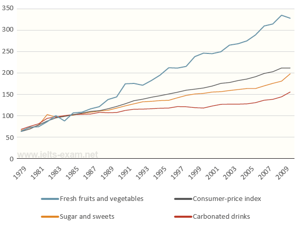
It is clear from the line graph that there was upward trends in both three food product groups' prices and the CPI. Additionally, the cost of fresh fruits and vegetables experienced the most noticable change.
In 1979, the costs of three food groups and the CPI were almost the same, around 60. In contrast, there was a slight fluctuation in the price for fresh fruits and vegetables between 1979 and 1985, before increasing dramatically in the next 24 years. It reached the peak at around 330 in 2008 and gently dropped by 10 in the year following.
Over the same period, the CPI rose steadily from about 60 in 1979 to above 200 in 2009. The prices for sugar and sweets and carbonated drinks followed a same upward pattern, with growing to 200 and 150 in 2009, respectively. Although their prices also rose, they were consistently below the consumer average after 1987.
Top answer
The line graph illustrates the changes in the price of three different food product groups in the USA from 1979 to 2009 and the overall trend of the consume r p rice index (CPI) over this that 30-year period. It is clear from the line graph that there was were upward trends in both all three food product groups' prices and the CPI. Additionally, the cost of fresh fruits and vegetables experienced the most n ota ble change.
- The line graph illustrates the changes in the price of three different food product groups in the USA from 1979 to 2009 and the overall trend of the consume r p rice index (CPI) over this that 30-year period.
- It is clear from the line graph that there was were upward trends in both all three food product groups' prices and the CPI.
- Additionally, the cost of fresh fruits and vegetables experienced the most n ota ble change.
- In 1979, the costs of figures for the three food groups and the CPI were almost the same, around 60.
- In contrast, there was a slight fluctuation in the price for fresh fruits and vegetables between 1979 and 1985, before increasing dramatically in over the next 24 years.
Get the Weekly English Kit 📬
New words, one handy idiom, and a 2-minute quiz — delivered to your inbox to keep your streak alive.
The line graph illustrates the changes in the price of three different food product groups in the USA from 1979 to 2009 and the overall trend of the consumer price index (CPI) over this that 30-year period.
It is clear from the line graph that there was were upward trends in both all three food product groups' pri
 Related Questions