
IELTS WRITING TASK 1. Comment please. Thank youu!!
Answer.
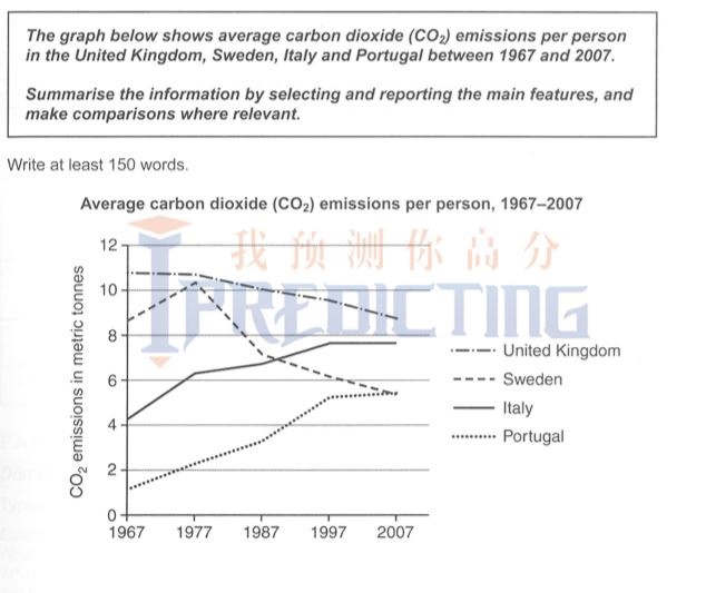
The amounts of carbon dioxide (CO2) generated per capita in the United Kingdom, Sweden, Italy, and Portugal from 1967 to 2007 are plotted on the chart. The unit is in metric tonnes(mt).
While United Kingdom and Sweden had general downward trends in the first 20 years from 1967 to 1987, Italy and Portugal's value had increased over the time period.
From 1967 to 1977, Sweden, Italy and Portugal's average amount of CO2 produced grew with the fastest rate, 4.1 to 6.2 mt for Italy, from 1.1 to 2.1 mt for Portugal and Sweden peaked at 10.2 mt in 1997. The UK, however, produced 0.1 mt less in this period.
In the next 20 years, the amount of CO2 generated by Portugal and Italy continued to go up to 5.1 mt and 7.8 mt respectively and then leveled off from 1997 to 2007. UK had a linear downward curve in all time period, which ended at 9 mt in 2007. Sweden's plummeted from its peak in 1997 to roughly 7 mt in 1987 and then decreased by another 2 mt down to 5 mt in 2007.
Top answer
The amounts of carbon dioxide (CO2) generated per capita in the United Kingdom, Sweden, Italy, and Portugal from 1967 to 2007 are plotted on the chart . (Charts are bar charts and pie charts. ) The unit s are metric tonnes (mt).
- The amounts of carbon dioxide (CO2) generated per capita in the United Kingdom, Sweden, Italy, and Portugal from 1967 to 2007 are plotted on the chart .
- (Charts are bar charts and pie charts.
- ) The unit s are metric tonnes (mt).
- While United Kingdom and Sweden had general downward trends in the first 20 years from 1967 to 1987, Italy and Portugal's value emissions had increased over the time period.
- 2 mt (The units for values expressed as rates cannot be metric tonnes.
Get the Weekly English Kit 📬
New words, one handy idiom, and a 2-minute quiz — delivered to your inbox to keep your streak alive.
The amounts of carbon dioxide (CO2) generated per capita in the United Kingdom, Sweden, Italy, and Portugal from 1967 to 2007 are plotted on the chart. (Charts are bar charts and pie charts. Is this a chart?) The units are metric tonnes (mt).
While United Kingdom and Sweden had general downward trends in the first 20 years fro
Hie! In 3rd para, you have written Sweden peaked at 10.2 mt in 1997 (which is actually 1977) & in last para Sweden's plummeted from its peak in 1997 (which is again 1977) to roughly 7 mt in 1987
 Related Questions