
Ielts writing task 1 (barchart)
This task is a little difficult for me. Please check this essay if you have time. Thank you in advance.
You should spend about 20 minutes on this task.
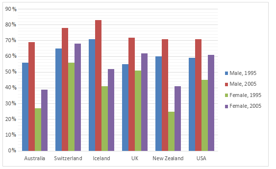
The graph below shows information on employment rates across 6 countries in 1995 and 2005.
Summarise the information by choosing and describe the main idea, and make comparisons where appropriate.
» Write at least 150 words.
Employment Rates by Country, 1995-2005
Answer:
The supplied bar graph compares the employment rates between working men and women in 6 different countries including Australia, Switzerland, Iceland, UK, New Zealand and the USA for the years 1995 and 2005.
It is clear that more men were employed than that of women in all of the given six nations. the second biggest point is that the employment conditions in Iceland, Switzerland were comparatively better than the other four countries.
As is observed from the given data, the gap between male and female job holders ranged from approximately 10% to 18% over the six countries in the time mentioned. The greatest scale occurred in New Zealand and USA in the year 2005. Specifically, there was about 62 percent of men who had a job, but only 44 percent of women were employed in the USA whereas these figures were 42 percent and 24 percent respectively in New Zealand. On the contrary, Iceland was the place where showed the smallest difference in the percentage of male and female workers. It was 52 percent for men and this sector for women was nearly 42 percent.
For male gender, among 6 countries above, it can be seen that labor market was by far the most abundant in Iceland with approximately 71 percent and 83 percent of men were hired in 1995 and 2005 respectively. For female gender, Switzerland was the place where satisfied the highest ratio demand for job seekers. According to the statistic, 55 percent and 68 percent of women could find their job in 1995 and 2005 respectively.
Top answer
Lover english The supplied bar graph compares the employment rates between working men and women in 6 different countries including Australia, Switzerland, Iceland, UK , New Zealand and the USA for the years 1995 and 2005. The highlighted part should be the UK . Lover english It is clear that more men were employed than that of women The highlighted part is superfluous.
- Lover english The supplied bar graph compares the employment rates between working men and women in 6 different countries including Australia, Switzerland, Iceland, UK , New Zealand and the USA for the years 1995 and 2005.
- The highlighted part should be the UK .
- Lover english It is clear that more men were employed than that of women The highlighted part is superfluous.
Get the Weekly English Kit 📬
New words, one handy idiom, and a 2-minute quiz — delivered to your inbox to keep your streak alive.
Lover englishThe supplied bar graph compares the employment rates between working men and women in 6 different countries including Australia, Switzerland, Iceland, UK, New Zealand and the USA for the years 1995 and 2005.
The highlighted part should be the UK.
Lover englishIt i
The supplied given bar graph compares the employment rates between working of men and women in six different countries: including Australia, Switzerland, Iceland,
Overall, it is clear from a cursory glance at the graph that widely people like to visit the cinemas on weekends. Although, Sunday was also a popular day for visiting the cinemas, although, comparatively less to Saturday.
As can be seen from the chart, Tuesday, Wednesday, Thursd
 Related Questions