
IELTS WRITING TASK 1 - BAR CHARTS
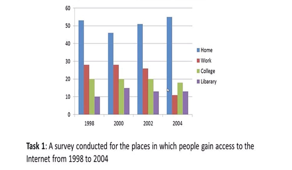
A survey conducted for the places in which people gain access to the Internet from 1998 to 2004.
My answer:
The bar chart compares the percentage of people who connected to the Internet in four types of locations between 1998 and 2004.
Overall, the number of people using the Internet at home and in the library remained relatively constant, while the figures for access at work and college decreased steadily in those years shown. In addition, home was by far the most common place where users accessed the Internet.
In 1998, the proportion of users accessing the Internet from home was highest, at around 53%. By contrast, the rate for those who used Internet at the library was at the lowest point, at exactly 10%. Approximately 27% of Internet users connected at work, compared to precisely 20% at college.
The percentage of people who gained access to the Internet at home rose to 55% in 2004, though it had a decline of about 8% in 2000. On the other hand, the figures for access Internet at work and college decreased to around 10% and to 18% respectively, over the period. Users accessing the Internet at the library increased by about 5% from 1998 to 2000 and then dipped slightly in 2002, where it had the same rate throughout 2004.
Please help me find out some mistakes that I have made on my essay. Thank you for reading ^^
Top answer
This is not a usual IELTS Task 1. The question is somewhat difficult to decipher. Is there a more detailed description?
- This is not a usual IELTS Task 1.
- The question is somewhat difficult to decipher.
- Is there a more detailed description?
- The bar chart compares the results of surveys asking people which of four locations (home, work, college and a library) they used to connect to the internet.
- Four years are shown: 1998, 2000, 2002 and 2004.
Get the Weekly English Kit 📬
New words, one handy idiom, and a 2-minute quiz — delivered to your inbox to keep your streak alive.
This is not a usual IELTS Task 1. The question is somewhat difficult to decipher. Is there a more detailed description?
The bar chart compares the results of surveys asking people which of four locations (home, work, college and a library) they used to connect to the internet. Four years are shown: 1998, 2000, 2002 and 2004. The chart plots percentage
 Related Questions