
IELTS Writing Task 1 - Bar chart
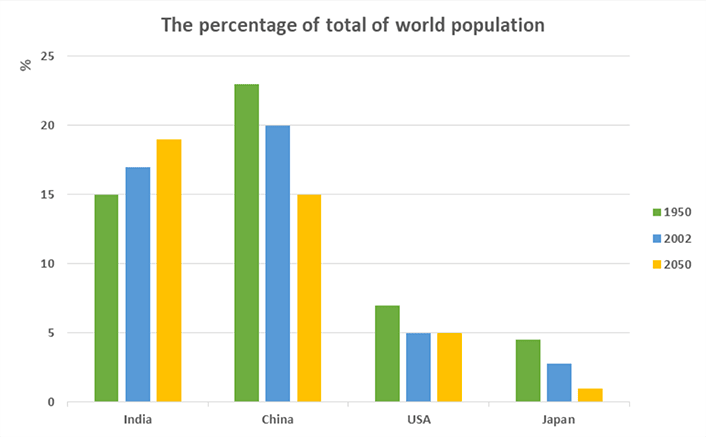
The bar graph compares percentage of people living in different countries in relation to the world's population in 1950, 2002 and in addition, predictions for 2050. Overall, China had the highest percentage of the world population in 1950 and 2002 and being outnumbered in 2050 forecast by India, subsequently slipped back to the second place after dramatic fall approximately in ten per cent. There was a steady growth in India's population throughout the whole period, rising from fifteen per cent in 1950 to sixteen and eighteen per cent in 2002 and 2050 respectively.Whereas, last two countries followed the same pattern as China, except the United States period between 2002 and 2050, when figures leveled off at five percent. Meanwhile China and India had the highest figures, the lowest point belongs to Japan, where ratio remained the smallest and will decrease gradually till right below three per cent in 2050.
p.s i'm preparing for the ielts exam, pls go ahead and correct my essay where's relevant, i'm looking forward for ur critique. with best regards, ur Augustus :*
Top answer
First, you will lose points by not writing in paragraphs. Three paragraphs is about right for Task 1. Each paragraph has a different point, so I suggest these.
- First, you will lose points by not writing in paragraphs.
- Three paragraphs is about right for Task 1.
- Each paragraph has a different point, so I suggest these.
- 1.
- Describe the figure, but not the information content.
Get the Weekly English Kit 📬
New words, one handy idiom, and a 2-minute quiz — delivered to your inbox to keep your streak alive.
First, you will lose points by not writing in paragraphs. Three paragraphs is about right for Task 1. Each paragraph has a different point, so I suggest these.
1. Describe the figure, but not the information content. Show that you fully understand the infographic.
2. Pick out 2 or three "main features", as required by the instructions. Show these to the examiner in the second
 Related Questions